Category

pizza

Whose Pizza (UX) Reigns Supreme!?!

By | pizza, ux | No Comments

“Allez cuisine!”

This is the big finish! The last of a five part series breaking down the user experience for three of the national chain pizza delivery stores. The first post breaks down the what and the why behind the series and the following three analyze the online ordering user experience for Papa John’s, Pizza Hut and Domino’s.

This analysis is based on online ordering using my 13” MacBook on a Chrome browser. I’m a user that has an account, but haven’t ordered for a while and not signed in. I want pizza for my friends and I on a Friday night.

The four categories I evaluated were:

  • Onboarding/First Interaction
  • Pizza Builder
  • Post Creation and Checkout
  • Post Checkout

All three of these companies are managing multiple products and many points of user experience and this is only a breakdown of one aspect. Beyond this there could (and should) be tests run on the mobile app, mobile web ordering, overall menu organization, ordering for an avid user, ordering for a normal return user, big orders and so on. Being very specific in your test is important in order to limit the variables and come away with actionable results.

Hypotheses

The original hypotheses I made were:

  • Users will be able to easily add a pizza to their cart and checkout quickly
  • All the experiences will be fairly similar
  • Only minor UX issues will present themselves

The first two are true. With all three experiences users can get in, create a pizza add it to their cart and checkout quickly. I should have defined quickly as a hard and fast number to be able to analyze this better, but my Mom could do it in less than 10 minutes and that’s the bar I’ll use.

All the experiences were fairly similar as far as structure. Homepage > capture information > pizza builder > upsell > checkout > post.

There was a major UX issue which I’ll cover below, so my third prediction was a little off.

Onboarding/First Interaction
Winner: Papa John’s

While all three had beautiful home pages, once you stepped into the experience it was Papa John’s that had the most user friendly introduction by stepping the user through connecting to the store nearest them before diving in.

There was a small hiccup after I let them know where I was which took me to Menu instead of Specials, but of the three this was the most minor infraction. Domino’s was the only one of the three to get this right and take me where I was trying to go prior to information gathering.

Domino’s and Pizza Hut both created a barrier for the user to climb before getting to ordering their food. Papa John’s asked for the information that was needed at the right time, communicated clearly as to why they needed it and created a connection between the user and the store with the phrase “Find Your Store.”

The major UX issue was with Pizza Hut onboarding and the fact that it took five clicks to get back to ordering my food and then I was thrown in the middle of a page with no reference as to what I was doing. You can read about it in my full Pizza Hut breakdown.

Pizza Builder
Winner: Pizza Hut

Building a pizza is hard work and then you combine that with a meal deal or special involving multiple options it becomes a hard core UX challenge.

Pizza Hut had a few issues but overall their pizza building experience beat out the rest. There were several aspects that stood out above the competition.

Keeping the pizza centered on the screen – as the user scrolls through the process building their pizza, the picture is always there for reference, front and center.

Organization – numbering all steps in the process vertically, pushing the user through their choices in a very clear and concise way.

The picture speaks – updating every aspect of the pizza on the picture. Crust, no cheese, type of sauce, regular toppings, extra toppings, half and half, they never missed a beat, it was all shown on the picture.

An overview – Scrolling through all the steps, the last thing you see is a clear, well-designed overview of the order, prior to moving on.

Post Creation and Checkout
Winner: Pizza Hut

This was category was close.

It was a toss-up between Papa John’s and Pizza Hut. Both sites had an easy checkout, but Pizza Hut was the winner because of Papa John’s disappearing checkout button.  Papa John’s had a checkout button that would disappear after being on the “Can We Tempt You?” screen for 10 seconds, potentially leaving the user confused, as I was. Read about it in my full Papa John’s breakdown.

Pizza Hut also placed buttons at both the top and bottom of the screen to get to the order and also to ultimately checkout. The buttons to achieve this were gray, which I recommend updating to a less disabled color, but it’s better than no button at all.

Domino’s checkout was acceptable but the review screen where it creates steps for users to follow which aren’t really steps at all took them out of the running. Read about it in my full Domino’s breakdown.

Post Checkout
Winner: Domino’s

This one was easy. Domino’s is the only one with a post-checkout experience and it does wonders for them. Users think Domino’s is awesome because they are left with a final awesome experience. But it’s not just because it was the only experience, the Pizza Tracker is really cool, and it keeps the user engaged in the 30-40 minutes between order and delivery.

Domino’s is focused on improving the technology and doing amazing (crazy) things like delivering by robot and had its first pizza delivered by drone.

These things matter and users are left with a feeling that Domino’s is cool and that’s a lasting impression that’s helping to sell more pizza.

To read more about how Domino’s reinvented itself in the tech space, check out this article.

Overall

All three experiences accomplished the goal. Get pizza delivered to my house for my friends on a Friday night. There wasn’t one experience where I felt like throwing my computer through a window, but there was one experience that I felt took more consideration for a first time user and the flow that is required to get that user across the finish line.

In the end, it came down to a hiccup in Pizza Hut’s initial experience that kept them from taking the crown.

Winner: 

Papa John's

If you’re like me, you’ll probably want some pizza now. Go for it:

I hope you enjoyed this series, it was a lot of fun to put together, comparing and contrasting some of the top chains in the country. Plus, I had an awesome night ordering some pizzas with friends. I am considering doing another look at the experiences focused on mobile ordering. If that’s something you’d want to see, leave me a comment below or share on social media.

The Domino’s Experience

By | pizza, ux | No Comments

This is the last of three breakdowns for The Pizza UX Challenge. Check out the overview of The Pizza UX Challenge here.

In this post I slice through the user experience for online ordering with Domino’s (dominos.com). I approached this site as if I was a normal user (which I am) ordering pizza for me and my friends on a Friday night using my 13” MacBook Pro on a Chrome browser.

This is the homepage. The design is stylized and clean, but it could use a little room to breath. Even the pictures are cramped with food and words and buttons. 10-20 pixels of gutter space between each section could accomplish this with little detriment to the overall design.

I like the fact that user action is being very clearly directed to either click the Choose Any 2 deal smack dab in the center or Start Your Order by picking Delivery or Carryout at the very top. As a bonus, the Order Now buttons have a shiny hover effect, it’s very slick and a nice touch.

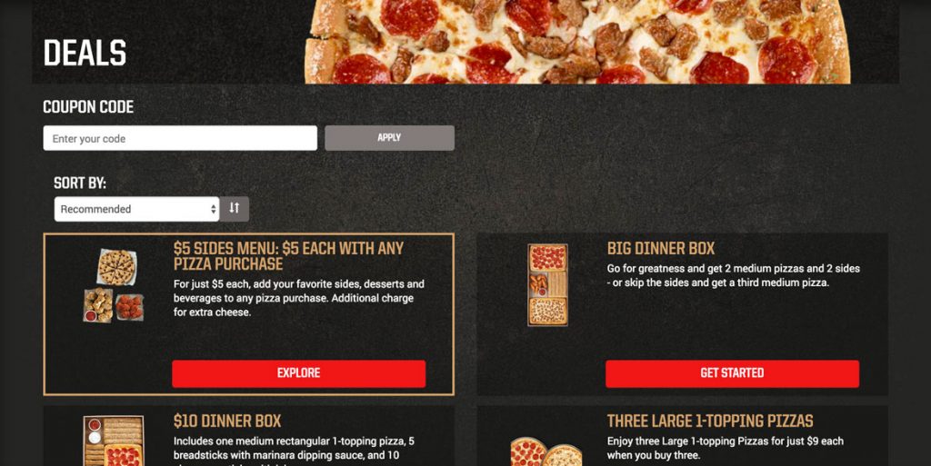
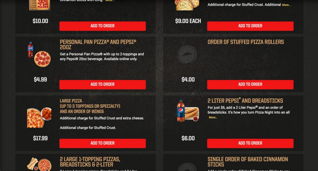
Typically I look for specials or deals and see if there is anything beyond the main offer that I’d be interested in. In looking over this page I’m going to guess that the Coupons menu item could be deals, but it could also be for people who already have coupons, which I don’t.

I’ll click in and check it out.

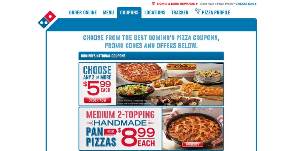
Ah, yes it is a deals page. Coupons, promo codes and offers. It would make more sense to call the menu item offers, specials or deals instead of coupons in order to make it clear to users that they don’t need to have a coupon in order to get a deal.

I will concede that the design of the home page looks like they want to funnel as many people into the main deal, so this wording choice could be intentional to deter people from clicking in.

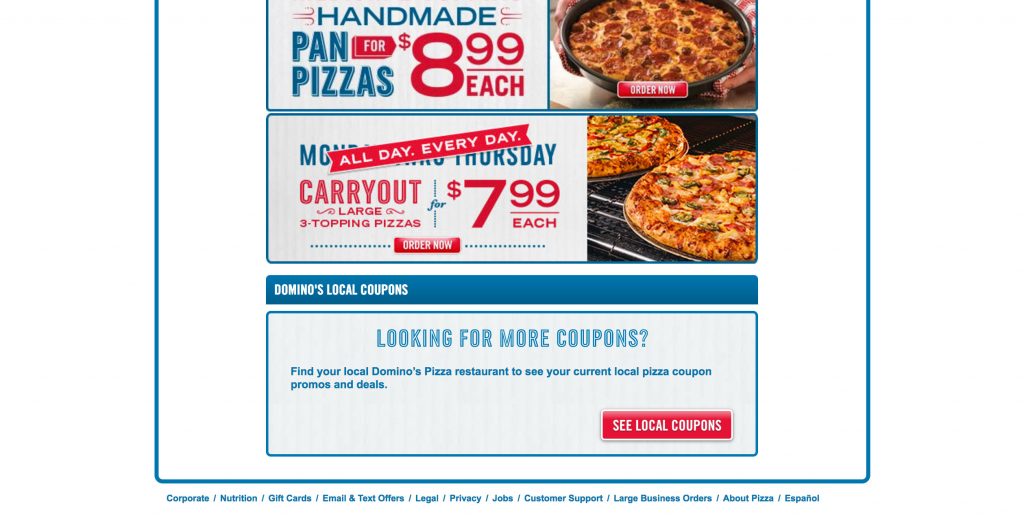
One thing I really like that on the Coupons page is that there are a couple national deals at the top and then local deals at the bottom. This is a subtle way of enticing the user to give you their information voluntarily by providing a benefit in exchange. It reduces friction.

I like the Choose Any 2 Deal under the national deals so click the picture to get started. It’s nice that the whole area is clickable and not just the button.

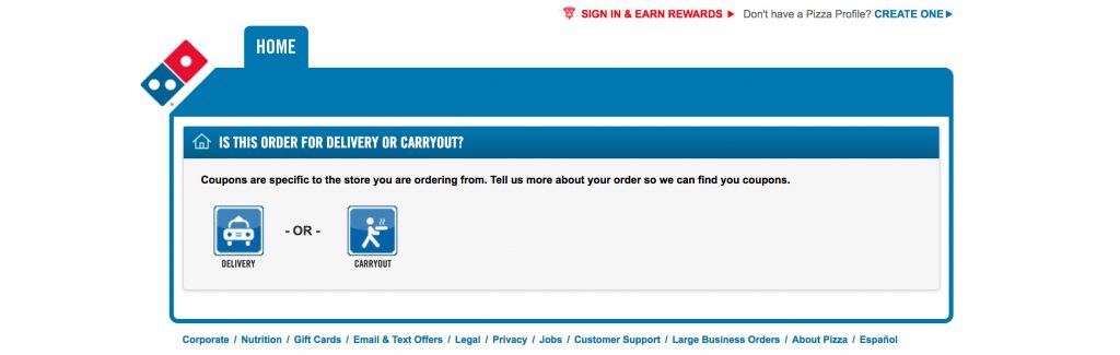
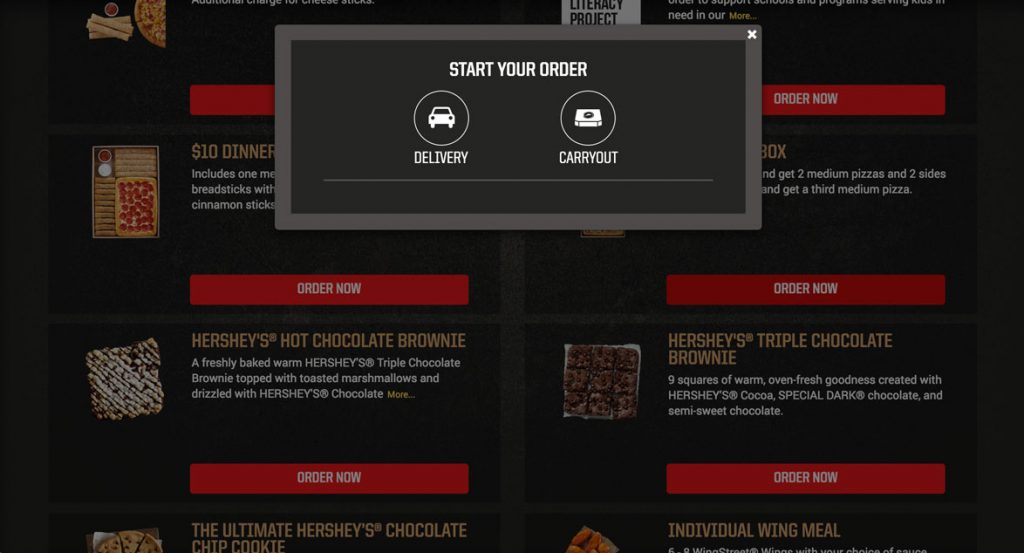
I’m presented with a page for defining delivery or carryout. This isn’t right. As a user I’m expecting to start building my pizza, but there is a message: “Coupons are specific to the store you are ordering from.” This would make sense except I just picked a national coupon so I’m left confused.

Perhaps some Domino’s have varying menu items that are offered in the Pick 2 deal. If that’s the case it makes perfect sense why they need your address right now, but it still doesn’t matter if it’s delivery or carryout.

As I mentioned with Pizza Hut, this is an opportunity to connect a user to the store in their area and to create a subconscious connection by calling it “Your Store”. 

To be fair, most users are going to see the Delivery and Carryout buttons and just click the one that’s right for them without thinking, so it’s not that much of a roadblock.

I click Delivery.

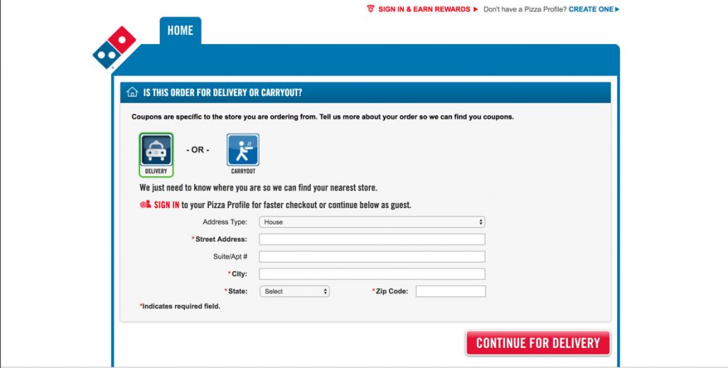
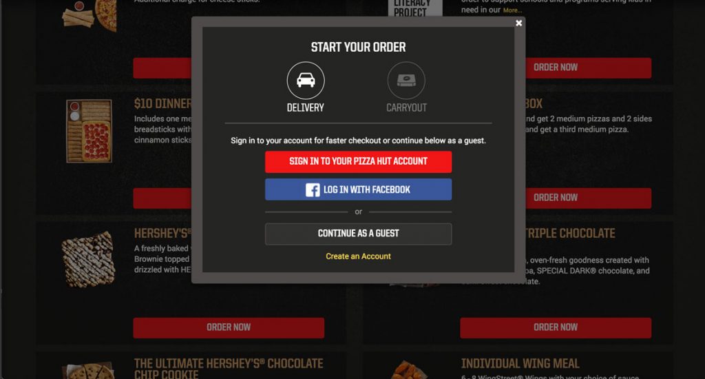
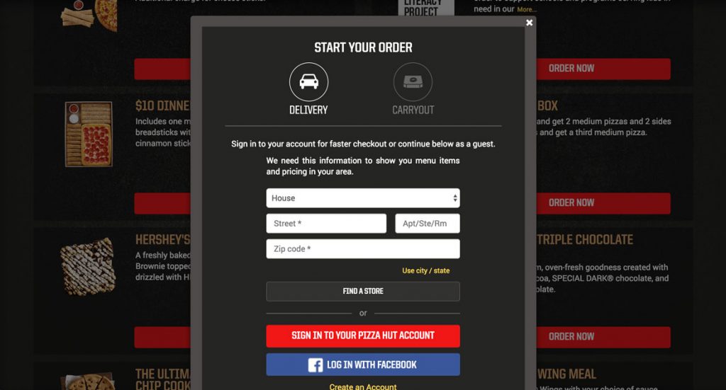
“We just need to know where you are so we can find your nearest store.” Since we’re down the Delivery rabbit hole already this makes sense. I can sign in or continue as a guest.

I’ll try to continue as Guest. I put in my address and I’m taken right to the first step of the Coupon Wizard.

Nice!

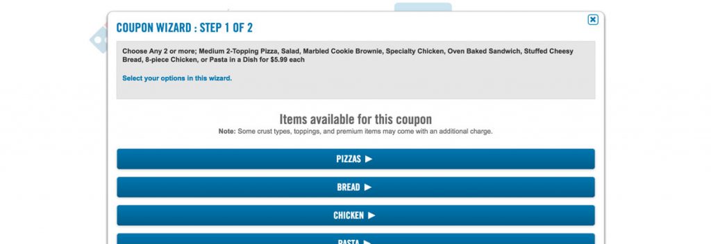
There’s a few issues with this layout.

First, while it does stick with the overall styling of the site it takes a dive compared to the design I’ve been immersed in up to this point. The gray box at the top has a lot of black text that lists all the options I can choose from, but they’re also listed below in a list. You could get away with just, Choose Any 2 of the below for $5.99 each. The blue text in the box seems like a link but it’s, it is just another instruction telling me I’m in the wizard. It’s completely unnecessary.

Moving down the page I really like that they have a note that there may be an additional charge for premium items. Now I know and knowing is half the battle.

The buttons are pretty bland, and my guess is the formatting is done this way so it’s responsive down to mobile (which it is), but in 768 and above you should have slightly larger buttons in two columns with beautiful pictures in order to enhance the experience and keep pushing that design from the home page throughout the experience. Technically, there’s nothing wrong with this, but it could be sexier.

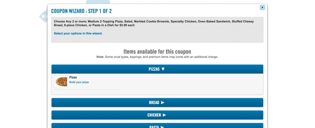
But what’s this? It’s an expandable menu…not a button. From a UI (user interface) perspective that could be cleared up by having the arrows point up instead of to the right. Up communicates collapsed menu, while right communicates new page. And when expanded the arrow should point down, as it currently is. 

Well I know one of my items is going to be a pizza, so I click Build your pizza.

I see that I’m still in the coupon wizard, but the gray box at the top is now completely unnecessary. Remove it and open up that much needed screen real estate.

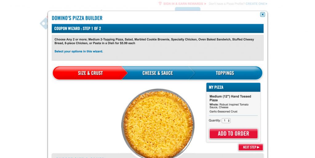
A big win for Domino’s is they have their three step wizard navigation all on one screen and when you interact with it, it works! It allows you to jump forward and back in the experience. It’s how it should work, but of the big three it’s the only one that does. 

I have to scroll down in order to determine next steps. I choose the Hand Tossed crust and click the red next step button.

The design of the choices is as simple as can be with standard check boxes and radio buttons. It works, but adding a bit of CSS flair would help match the beautifully styled progress indicator and buttons. The pizza itself is small and lackluster as well.

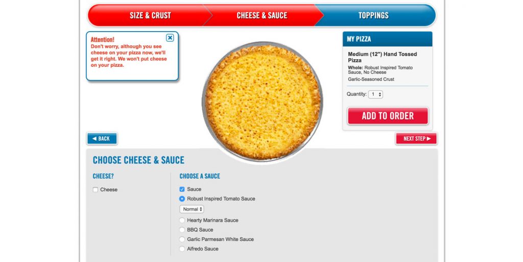
One thing that Domino’s can get partial credit for is that they let the users know that the picture isn’t being completely honest by showing cheese when no cheese is selected (note the message in the image above). But why? Why not invest a little bit more time and show no cheese and the variety of sauce options? If you’re going to use the picture to make people connect to a visual representation of their pizza do it right.


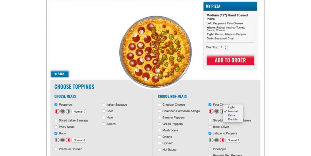
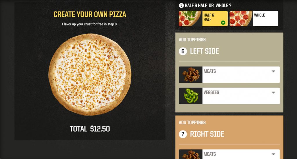
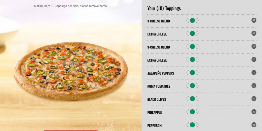
There is good and bad with the topping selections. It’s very simple, just standard check boxes and the icons representing half and whole options are pixilated and cropped poorly. A higher res PNG could solve this. But beyond the aesthetics Domino’s is solving a lot of problems that come with numerous topping choices.

I can see all the toppings on the screen at once, no scrolling.

I can choose half toppings, see the pizza update and have an iconic representation to make it clear.

I can choose light, extra or double toppings with no confusion and clear feedback.

While it lacks in sex appeal, it is highly functional.

Above the Add to Order button there is a section that gives an overview of the pizza. This section needs design love as well. It’s trying to give the user a summary of the choices made, but it’s a lot of small text crammed together and is hard to read. Each topping on their own line would solve this problem. In addition, taking the sauce and cheese out of the toppings section and throwing them down with the crust would create a more logical separation. 

All that said, I very much like that I can update the quantity here before I add to order. One is enough for today, Add to Order!

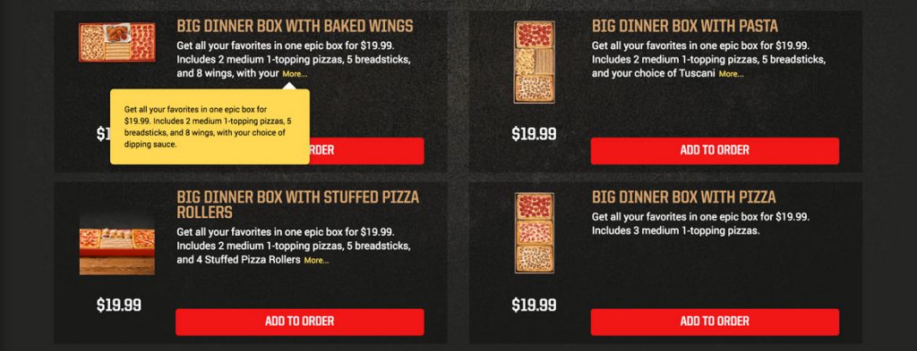
For the second item I chose the Bacon Jalapeno bread (unanimously chosen as the best thing we ordered that night) and then I was taken to the coupon complete screen.

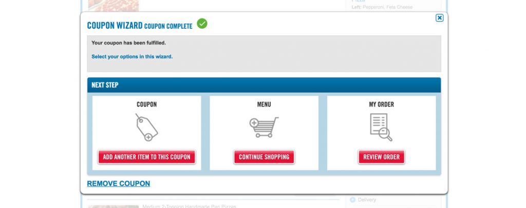
I like this resolve screen, but it’s missing an opportunity and should suggest complimentary items for my order.

The “Add another item to this coupon” button should be clarified to remind the user that the deal is choose any two or more. Combine these efforts and show off some options that other users have added or suggest dessert and a salad to go with my pizza and bread to create a full meal for an additional $5.99 each.  

The gray box is completely unnecessary on this pop up as it tells me very clearly at the top that the coupon is complete.  The blue “Select your options in this wizard.” is incorrect and irrelevant. I can see it as nothing other than a mistake.

I’m done shopping and I’m ready to review my order so I click the big white box and nothing happens. Unlike the previous interaction where I could click anywhere in the surrounding holder I have to click the actual button this time to get out.

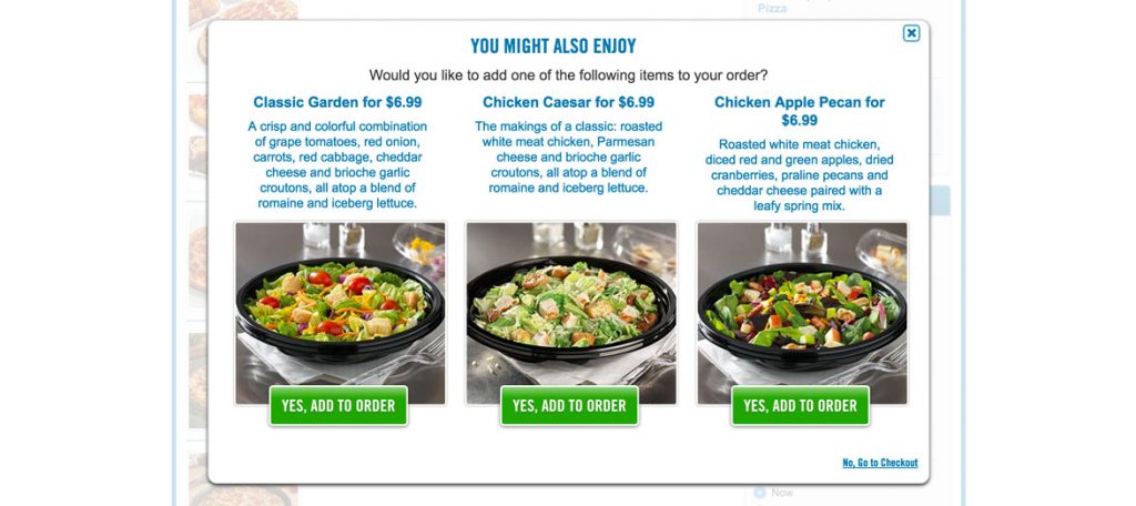
I spoke too soon, now they are trying to upsell me. This is a very clean pop-up, with the design falling more inline with the high quality I was first greeted with. I like the use of green to entice a click, but I just came from the $5.99 coupon so these should all be available at the sale price.

While I like the design here I recommend decreasing the font size by a point or two so that Chicken Apple Pecan stays on one line rather than falling to two and shifting everything down. I understand that this is very nit picky but the word “Go” in “No, Go to checkout” should be lowercase, it looks weird and it’s wrong.

I decide to add a salad to my order to check that it applies the right price and also to see if I can click yes for multiple salads.

The pop up only allowed for one of the three salads to be added before disappearing and resolving to the checkout screen. That is an acceptable user flow, but there is a missed revenue opportunity. However, the price was applied appropriately based on the coupon, so those prices should be updated on the pop-up with a little back end logic.

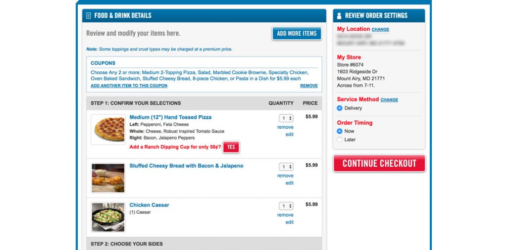
Unfortunately there’s a lot I don’t like about this checkout experience.

The initial impression is good, clearly laying out the items I picked and a summary of the order settings for confirmation. No problems until I start scrolling down.

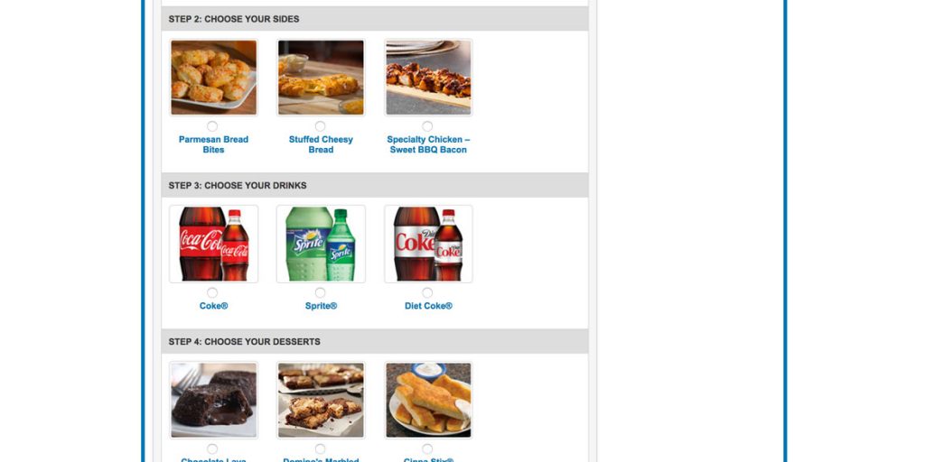
There are steps. Steps 2 – 5 in fact. I’m confused…do I get a side, a drink and a dessert with my coupon? I decided to try and clicked to add Sweet BBQ Bacon chicken…I mean if it’s free, why not.

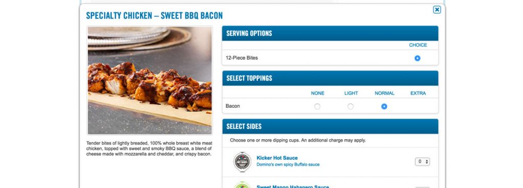
There is no mention that I’m going to be charged, except if I choose too many dipping cups…but even that doesn’t tell me how many is too many, so I’ll try 2 cups of hot sauce and add to order.

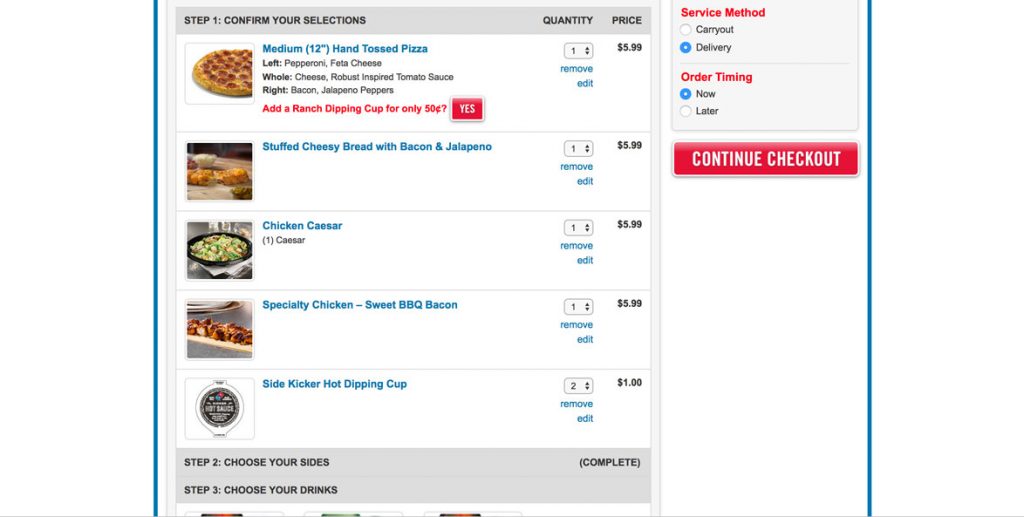
Oh brother. It wasn’t free and now it’s added to my order as are the two cups of hot sauce. But it says step 2 is complete, so I have that going for me!

I didn’t think that the extra item was going to be free, but the point is a valid one. By calling them steps and assigning no message to the user that they will be charged makes it seem as if those things are included in something they have already purchased. It’s tricky and confusing. I recommend updating the language immediately. For example, “Add a Side” instead of “Step 2: Choose Your Sides”.

One of the goals of a UX designer is to create an experience where your user has to think as little as possible and this experience causes the brain to fire in multiple directions.

The final issue I have with the checkout is that once I scroll all the way to the bottom the only way I can actually checkout out is to scroll back up to the top.

The best solution is to allow that snazzy little menu on the right hand side to scroll with the user as I go down the page so when I get to the bottom I can see all my settings and my price all in one place. The alternative (easier to implement) solution is to throw a checkout button at the bottom as well.

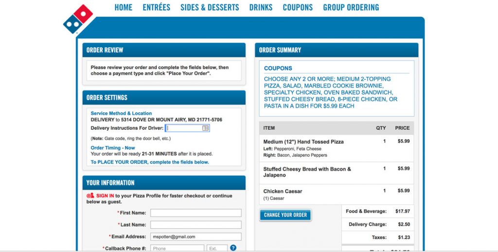
I’m taken to this review screen…but I thought that’s what I just did on the last screen. Hmmm.

This page is a disaster. There are so many boxes and so much text I’m not sure where to start and my eyes flick all over the place. I scroll down the page looking for somewhere to focus and see payment options and a big red place your order button, so I get out of here as quick as possible.

There were multiple interaction points I skipped on this page because of overwhelm. There were even options that could make my experience easier next time. Creating an account or a pizza profile would make things faster and even get me rewards, but I chose to evacuate rather than try to navigate the mess.

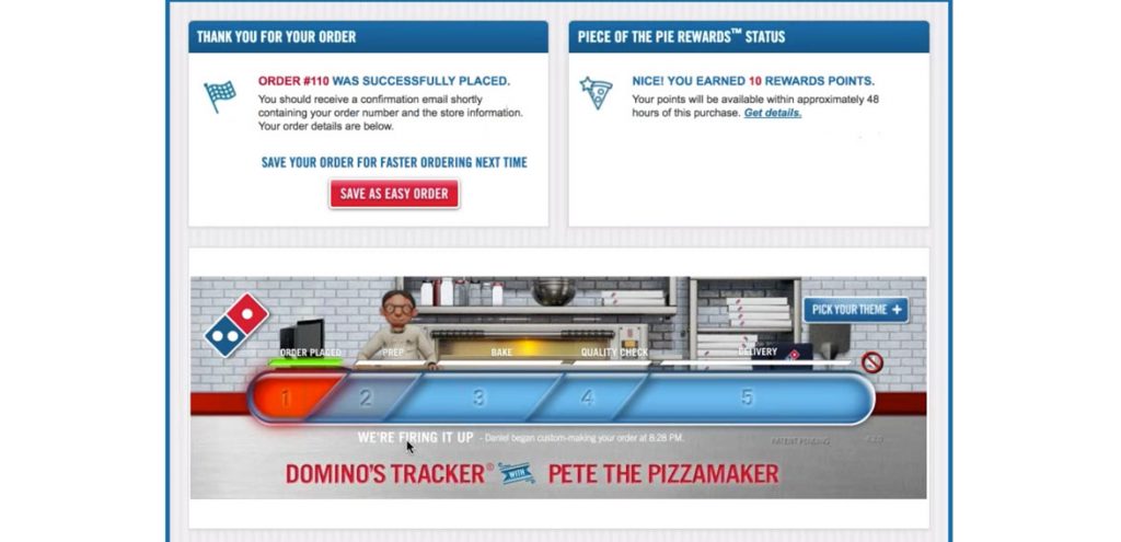
This is where Domino’s shines, after my order is placed. They have a real time update of what’s going on with your food including the name of the person preparing, when it goes in the oven, when it leaves Domino’s and the name of the driver. And they got Pete, that cute little pizza guy.

The design on this final page is much better than anything else throughout the experience which ties it more closely with the homepage.

This final experience for the user is a great note to end on because it leaves the user engaged and positive.

In mentioning this series of blog posts several people assumed Domino’s would be the hands down winner just because they have such fond memories of the Domino’s Tracker. And kids love it.

Overall Domino’s has a user flow which is pretty tight until the user gets to the checkout screen and the trickery that comes with it. Some sections are littered with subpar design, but that never kept me from getting to the goal which was feeding my hungry friends. There are also places to improve flow, remove confusion and increase revenue opportunity through subtle reminders and queues to users about how they could save money or create more of a meal. All that considered Domino’s has a clean intuitive flow for adding and creating pizzas delivered hot to your door. 


And that wraps up the final analysis in the Pizza UX Challenge. In the next post I’ll be comparing the three and picking my favorite UX of the three. If you haven’t read the write ups on Papa Johns or Pizza Hut, check em out and as always, let me know what you think.

The Pizza Hut Experience

By | pizza, ux | No Comments

If you haven’t read my overview of The Pizza UX Challenge you can check it out here.

In this post I cut into the user experience for online ordering through Pizza Hut (pizzahut.com).  I approached this site as if I was a normal user ordering pizza for me and my friends on a Friday night, using my 13” MacBook Pro on a Chrome browser.

This is the homepage. Pizza Hut has definitely spent some money on design, the dark treatment is slick. The slider is the main focus with great imagery calling attention to big promotions.  It does shift a little too often, I’d recommend slowing it down by 2-3 seconds. The menu bar has a lot of options and there’s even some hiding – Pasta, Salads, Desserts and Sandwiches are all under the MORE dropdown. This distracts focus for the users. Are Sides and Drinks really so popular on their own that they need first-level treatment? I’ve always thought of them as supporting characters. 

Both Popular Pizzas and Re-order caught my attention as Pizza Hut intended with the bright red background against black. I was disappointed when I clicked on Popular Pizzas and it took me to the same place that Pizza link did. I guess I was expecting something more exciting, maybe even a chart showing orders over the last 7 days, but it did it’s job and I clicked.

Reorder is a cool idea. It’s great for people that order the same thing a lot, but as a user with the screen above I’m not going to come back here even if I do order from Pizza Hut more often. This experience has left me disappointed.

A few ideas to improve this experience would be to add some of the most favorited items or orders from all users under favorites and invite people to favorite one of them, instead of leaving it blank. Or add a favorite button next to the previous orders so I can start to engage with the idea of favorites. Again, a cool idea but it’s lackluster for a new user or first time returning user, but could be a chance to engage them and earn cool points. A simple solution is hide this from first time users all together and filter them into the site more tactically. 

I always look for the deals or specials on the site, first thing. For Pizza Hut, Deals is camouflaged. It’s sandwiched between the bright red buttons and the white links. And it’s gold, which blends in as your eye passes from the two bright portions of the menu. Regardless, I click Deals and we’re off to the races.

The page is two columns and each box is standardized with the button in the same place, a place for text and a small picture. The pictures look nice but they’re awful tiny. I’d scale them up and show them off. We picked Big Dinner Box and clicked Get Started…unfortunately getting started takes a bit of work.

This pop-up asking the user if they want Delivery or Carryout is the starting point. This doesn’t make sense here. Does it really matter until my cart is full and I’m ready to spend money? When I click order now I should begin building my big box so I get invested in my order.

Maybe Pizza Hut needs to know where I live because some locations have different items than others. If that’s the case, encourage the user to “Find Your Pizza Hut store”. By making it their store you provide a subconscious connection to add another level of investment and get the info you need in a low friction way.

We clicked delivery and…

What’s this? I understand signing in for faster checkout…at checkout, but not here. Let’s get to building my box.  I’ll just try to Continue as Guest so I can start building.

Now they tell me: “We need this information to show you menu items and pricing in your area.” Ok, since I’m not going to get around this quickly I’ll just log in with my account.

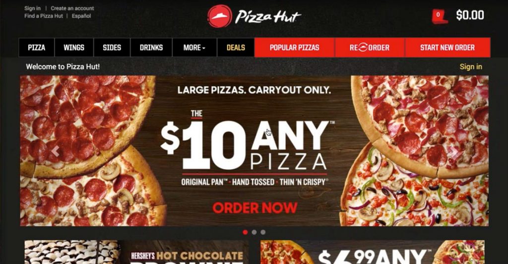
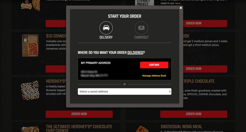
Yep, that’s my address and I’m ready to keep going. As a side note I do like the select a saved address drop down to make it easy for users to order from multiple locations, but I would style it to match the rest of the site. 

Continue!

What? Another confirm? Seriously, I just want to order my food. I understand that Pizza Hut wants to make sure the delivery time is okay with me, but I would only show a screen like this if the order time is much longer than normal with a message like “We’re really busy right now and order times are longer than normal. We just wanted to let you know.” 

Let’s get to it…Order Now!

And after all that I’m dumped back onto the Deals page…what was I ordering again?

After all of that I should be pushed into the creator so I can start building my Big Box, but I’m left here in the middle of the page waiting for something to happen. It’s frustrating and at this point I’m thinking about checking out the competition.

I scrolled back up the page, found the Big Dinner Box and clicked Get Started…again.

I was taken to another page with different options, which is awesome, kinda like Tetris but with food.

Instead of an Add To Order button they should say Customize or Add and Customize…something that lets me know that I’ll get to make adjustments prior to it being thrown in my cart. Also, a little nit picky but I don’t understand why they have the character limit on the description with the More… link when the text that’s missing could absolutely fit in the space. I thought it might be for responsive purposes, but scaling the screen down shows that they pick different character limits at different screen sizes.

Onward…Add to Order.

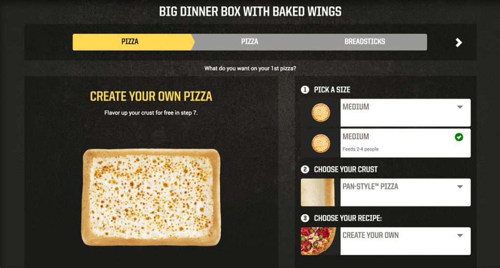
This screen looks really nice. It’s got the pizza on the left and a step by step process on the right. One update that could be made is to identify if there is only one option like under Pick a Size shown in the image above and instead remove the dropdown and say One Size. Not a big deal, but it shows you’re truly tailoring the experience.

A big win for this creator is that the pizza stays vertically centered on the screen no matter how far I scroll down. It’s what I was looking for with Papa John’s and I was really happy when I saw it being done here.

Pizza Hut’s solution for adding toppings are expandable menus, which while cumbersome is acceptable  because, the pizza stays centered. The menus have beautiful pictures of each of the topping choices and the ability to add extra which is a nice touch. When the toppings menus are collapsed, the toppings are a comma separated list. This could be cleaned up with a bulleted list, which would lengthen the box but make the topping choice much more clear. 

There was no way to do half toppings with this type of pizza, so I built another pizza and their solution is to make it a menu choice and then breaking down adding toppings to each size rather than an iconic representation. It gets super long when you start adding toppings. It seems like a quick hack way of handling it rather than thinking through the design of the problem and implementing a well thought out solution.

When you pick no cheese, the picture of the pizza updates accordingly, so I’ll put a point in the Pizza Hut column for that one.

When you scroll through all the steps and get to the bottom in order to move onto your next item Pizza Hut presents you with a summary of your order which I glazed over but upon second glance it’s a really nice touch (and they push the upsell of extra cheese again, so kudos there as well). Overall a really solid experience, cleanly designed and intuitive.

The rest of the Big Box was more of the same so I’ll jump ahead.  

After finishing up I was taken to the “Can We Tempt You?” page. It provides some options to add to my order and also gives me a clear way to continue shopping (add more food) or to view my order…but it’s gray. Gray means disabled, so while this is an active button I recommend changing the color, perhaps the gold or a red outline with red text.

They included buttons at the top and also at the bottom below the temptation options, which is great, so I can proceed to giving them my money. I clicked View Order and was taken to checkout.

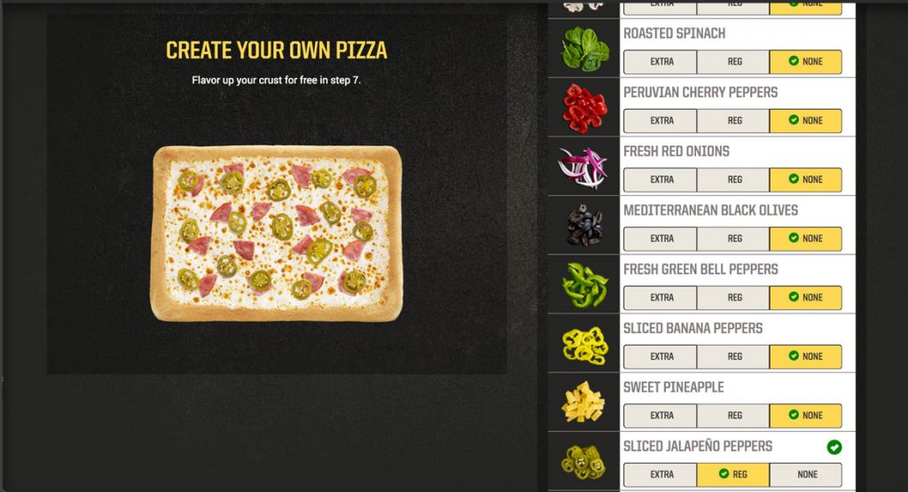
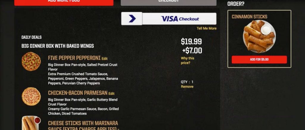
There were additional charges to the Big Box because of specialty pizzas, adding cheese to the breadsticks and other upgrades. Pizza Hut very clearly shows this as $19.99 + $7.00 and gives the user a “Why This Price” button. Unfortunately there is no clear breakdown of exactly what caused the 33% increase in price, just a definition of the types of things that can increase the price. A better experience would be to list the exact items that are causing additional charges and allow users to remove them in order to reduce their price.

Pizza Hut’s standard pizza customizer (as shown above) constantly updates the price below the pizza as you add toppings or make other changes that affect the price. For the Big Box, they could simply add a price updater under the pizza, in order to bring it in line with their standard high quality pizza building experience.

The argument could be made that most users are going to get to this stage and pull the trigger and just pay the extra $7.00 without thinking about it. They’re invested after all. The flip side of that could also be true in that a user gets to this point and says, “I thought I was getting a twenty dollar meal and now it’s closer to thirty, let’s check out what Domino’s has that’s comparable.” By being transparent it eliminates this possibility and will inspire users to gladly spend more because they’ve been eased into it throughout the process.

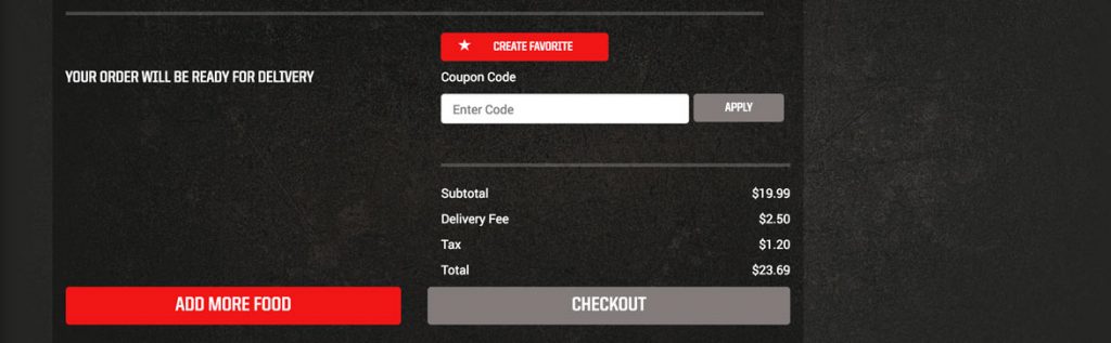
Even though the checkout button was also gray, the overall checkout was a simple two step process and they even asked for my birthday so they could send me a birthday treat, sweet! This is where the overall sign-up or sign-in should have been handled rather than earlier on in the process when I wasn’t yet committed, but because of all that up front work this was easy, but at the cost of a confused, frustrated first time user, which is when you need to get them to love you the most.

Overall Pizza Hut has a good experience, beyond the initial onboarding issues. The experience is well designed, clean and intuitive. The main menu bar could do with some clean up and adding half toppings isn’t optimal, but they are both functional as is. Another minor thing is the yellow box that pops up anytime something gets added to the cart which needs adjusting as it only flashes on the screen for 2 seconds and causes more confusion than help. For returning users and especially avid users this site is set up to make it easy to get in, order (or reorder) and get out, plus it looks good doing it. 

The Papa John’s Experience

By | pizza, ux | No Comments

In my last post I broke down The Pizza UX Challenge. You can read about it here.

In this post I dive into the user experience that comes with ordering pizza on Papa John’s (papajohns.com).  As I said in my last post, I approached the site as if I was a normal user (which I am) ordering pizza for me and my friends on a Friday night, using my 13” MacBook Pro in a Chrome browser.  

This is the home screen. It is clean, with a slider which promotes the current deals flipping between a great big picture of pizza and stuffed cheesesticks. Secondarily the red bar draws my attention to Menu, Specials and Papa Rewards. I almost completely miss the small menu items and the Enter a promo code form fill which makes sense in focusing your user towards the most important items. I’d be curious how many people are entering a promo code into this bar rather than just doing it at checkout.

Note: After a quick internet search I found a promo code which I applied here to receive 40% off a regular priced pizza, so this is something I’ll probably use in the future.

But for this user experience I clicked on Specials, because that’s what I would typically do on any online food ordering site, look for the deals. Papa John’s very clearly let’s me know that “Menu, Special Offers and Pricing may vary for each location.” so I need to let them know where I am. Makes sense to me. 

I also like that if I am carrying out I can just give them my zip code and not my whole address, it’s a nice touch for privacy. I enter my address, click Submit and am taken to…

…Menu, not Specials. That’s disappointing.

I even started scrolling down, was confused about the odd look of specials and had to click on the Specials menu item again.

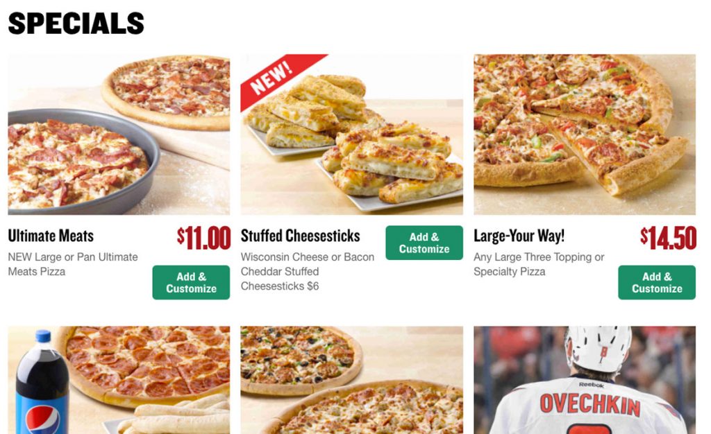
The Specials page is laid out in a 3 column view and looks clean, but with a slight modification could be improved by adding consistency to each item. Standardizing button placement as well as pricing would add uniformity to this page and give a better structure. Right now the buttons are positioned on the right, high and low, while some items have prices and others don’t. Also, letting the user click the beautiful picture as well as the Add & Customize button would be a nice touch. 

I clicked on Add & Customize for the Large-Your-Way! Deal. This opened up a new page with the options for specialty pizzas, from which I chose John’s Favorite and entered into the pizza customizer.

One thing that struck me right away with this page is the amount of screen real estate being eaten up by the top two menu bars which at this stage in the experience are unnecessary. As a user I am focused on creating my pizza and as a site designer I don’t want you navigating away from this experience, so it benefits both parties to hide these menus or at the very least shrink them significantly.

In addition, the step by step process indicator is larger than it needs to be. Beyond size, this progress indicator allows you to interact with the arrows on either side which takes you through each section (Size & Crust, Sauce & Cheese, Toppings). Each section seems as if it’s clickable, but when you click…nothing happens. Having a progress indicator in a wizard is a great way to show users where they are and how many steps are coming, but this one is suffering from a few problems. In order to fix it, put all steps on one screen, reduce the height and either make each step interactive or change remove the hover effect of a pointer indicating an interactive element.

One last note about the screen real estate. The font size for “Choose your size and crust” heading is huge. It doesn’t need to be this big. All together those four elements take up 57% of the screen so I’m forced to scroll down to get to the magic…

…and so I’m ready to start customizing the pizza.  The experience allows me to customize most anything I want and as I do so the picture of the pizza on the left to show off my updates.

It’s pretty cool.

But this too is oversized, so after I make my selections I have to scroll down to find the Next button. The pizza is floating in space on a heavenly looking counter and all that space could be shrunk in order to fit the pizza and the button on the screen at once.

When I do hit the Next: Sauce & Cheese button it shoots me back up to the top of the page and I have to scroll down again, and it does this with each step. Creating a holistic pizza building experience that resizes based on screen size would fix all of these issues. 

Aside from sizing, I only had two issues with the building experience, one big and one small.

The small issue is that if you choose no cheese, the pizza doesn’t update by removing the cheese from the picture. However if you change your sauce from Original to BBQ or vice versa the pizza does an animation showing you that the sauce has changed, then slapping the cheese back on, which is a nice touch. For users picking no cheese, not showing cheese would be optimal, but if that’s too much work, then at the very least tell the user that the picture does not represent what will be delivered.


The big issue is with the topping menu. I have four toppings chosen when I arrive (because of the specialty pizza I chose) but it only shows me two and then has a small call out to view 2 more. I know why they do this…to save space, but as this hasn’t been a priority with the rest of the experience why did they choose this as the place to show less information?

I do really like how easily Papa John’s allows you to pick half toppings and the graphic way in which a user can easily tell how the pizza is split up. The pizza even animates removing toppings from half. Also the presentation of the toppings, separated into Meats, Veggies and Cheeses with beautiful pictures is solid.

However, as I add toppings sometimes the pizza is only partially visible. If this is supposed to be the user’s focal point, the pizza should stay centered on the screen at all times no matter how much the right side grows or is scrolled.

In two instances I did things I wasn’t allowed to do. First, I added too many toppings (it tops out at 10) and then I took away too many toppings (you can only remove 2 toppings from a specialty pizza). In both instances a tiny error message was presented that I had to hunt for, because I couldn’t figure out why I was being stopped. It was tiny text above the pizza and both times it was actually off screen when it occurred so my experience just stopped working. An alert pop-up or a red message bar that sticks to the top of the screen would be much more noticeable and not leave the user feeling confused.

To be fair, Domino’s nor Pizza Hut had anything better when it came to adding toppings to the pizza, but I’ll cover that in their breakdowns. It’s an interesting design challenge that I’ll tackle in a future post.

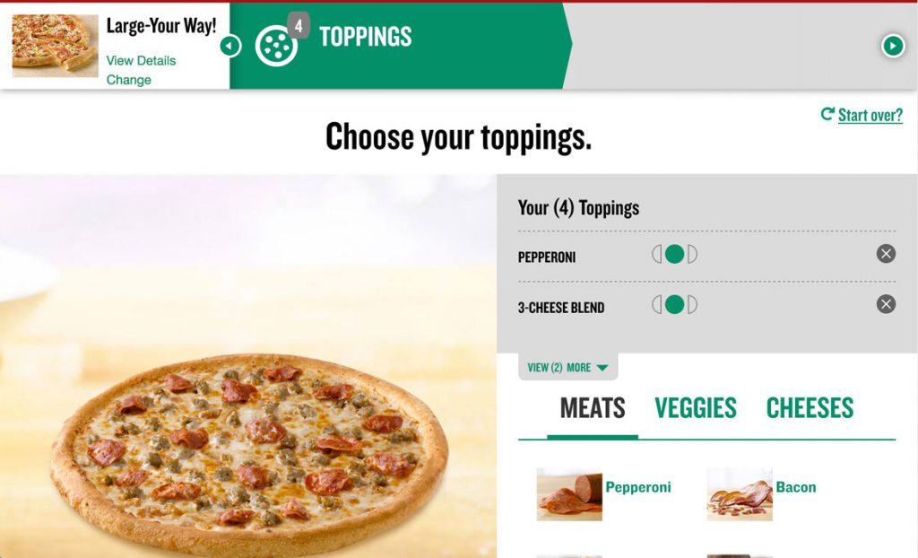
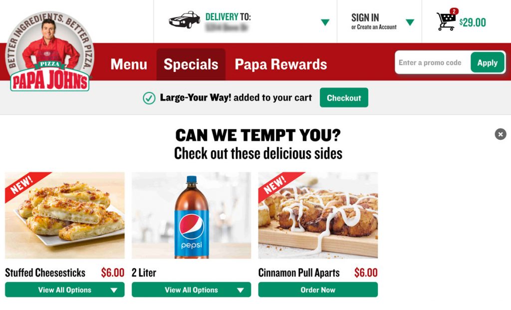
After finalizing my pizza customization I clicked the Add To Order button and was taken to a screen asking if I can be tempted with other offers, which is great. It’s a good time to upsell users.

Right below the main menu a message pops up “Large-Your-Way! added to your cart” with a green checkout button. I scrolled down the page to check out the other offers, but then when I scrolled back up the checkout button was gone. I went through the experience again to see what happened and after about 10 seconds this bar disappears leaving me in temptation limbo.

This shouldn’t happen. I’m not going to buy more now because I got stuck on this page. In fact, there should be an additional checkout button added below the temptation items as well to give me a clear path to get to the checkout when I’m ready to hand over my money.

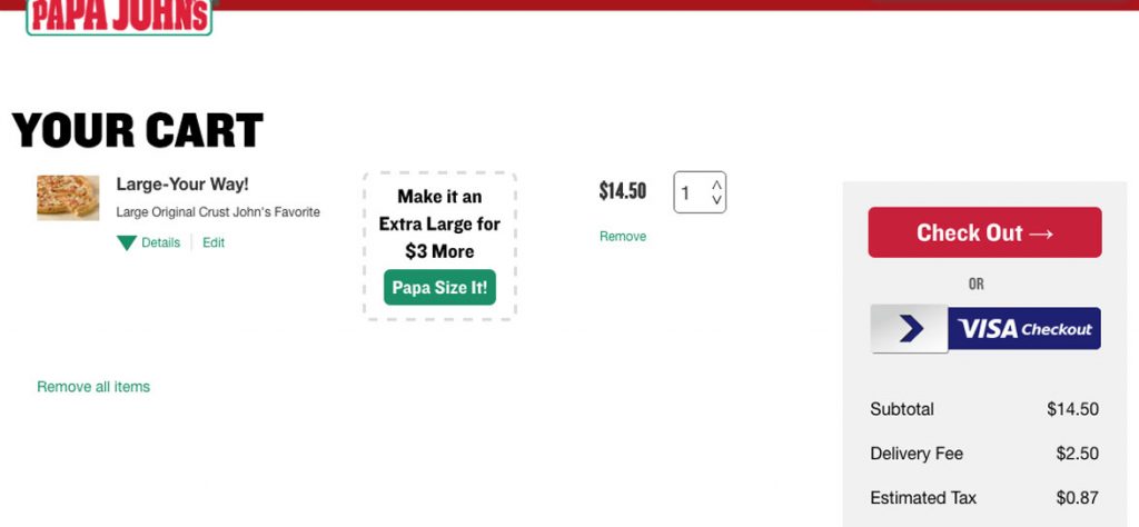
I ended up clicking on the Cart icon in the upper right corner. The cart could use some help with spacing as well, but I think I’ve covered that enough.  The Papa Size option is a nice touch. Overall this has everything I need and I quickly hit Checkout

For me, I already have an account and would like to sign in but my reaction was to begin filling in this information and then after a few keystrokes realize my mistake and look for the sign-in prompt. This could be avoided by moving the green sign-in button right under Tell Us About Yourself. I couldn’t miss it then.

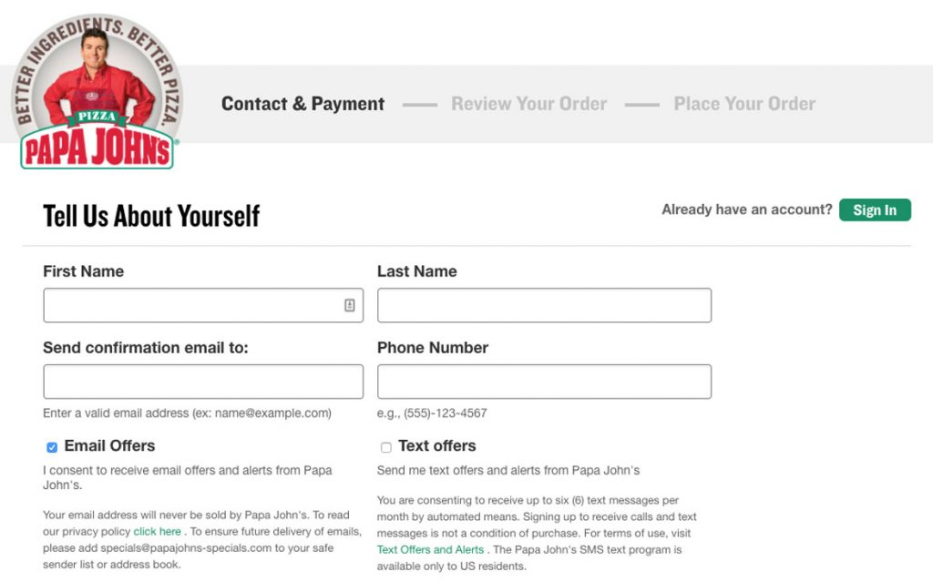
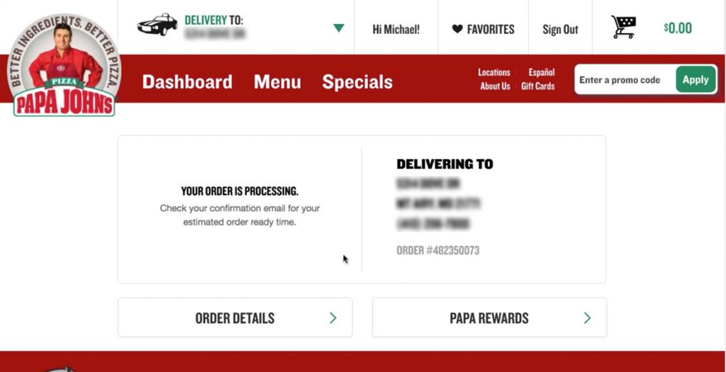
And the last few screens step you through the finalization process very smoothly and easily.

Boom! My pizza’s on the way. It would be nice to have some sort of update on the site itself instead of having to check my email, but I have no complaints about this experience. It works.

Overall, ordering from Papa John’s is easy and I only felt lost once, when I couldn’t find the checkout button that disappeared on me. There’s more scrolling than there needs to be in some places and the main navigation of the site could go on a diet (maybe it’s eaten too much pizza), but it never hindered me from getting to my end goal.  Rather it just made me think and click a little more than I should have to, which is exactly what you want your users to avoid doing – thinking too much.

This feedback is just from one user run through, which I hope helps to show the value of user testing and iterative design in order to get the most streamlined experience you can, because at the end of the day a better experience means happier customers and happier customers means more pizzas sold.   

The Pizza UX Challenge

By | pizza, ux | No Comments

My last series of posts were about conducting usability studies on your product in order to optimize the experience for the end user.

In order to put myself in the users seat I decided to conduct a study on something millions of Americans interact with every week: PIZZA.  There are 3 billion pizzas sold every year in the US alone which breaks down to 11.5 million pizzas every day. Papa John’s sells 350 million pizzas a year and 50% of those are done either online or through their mobile app.

I love pizza. It’s probably my favorite food and would eat it every day if I wasn’t concerned about my heart exploding. 

I decided to order from the three national chains near my home in Mt. Airy, MD (which is about 40 minutes outside of Baltimore), all in one night. Along with two of my friends we went through each experience and I’m going to break down what worked and what didn’t.  

I approached each website as if I was coming to their page as a normal user, recorded the session and noted any positives/negatives in the experience. This analysis does not take into account mobile web or mobile/tablet app experience. I did confirm that the tablet web experience was identical in all three cases to the experience on my computer. The obvious exception being a touch interface which could offer slight variations in experience.

With each site I was able to complete the order and like magic, 20-30 minutes later there was delicious food at my door.

The biggest surprise was that none of them had the experience as fine tuned as I originally thought they did. Or put more succinctly, there were more mouse clicks to get to where I wanted to end up than I remembered there being…and in one case it was almost painful.

The Breakdown

The places: Papa John’s, Pizza Hut, and Domino’s

Time: Friday night between 7:30 and 8:30pm

Order method: 13” Macbook Pro, Chrome browser

Hypothesis: Prior to running the experiment:

  • Users will be able to easily add a pizza to their cart and checkout quickly
  • All the experiences will be fairly similar
  • Only minor UX issues would present themselves

Additional facts:

  • I already had accounts with all three, so this does not judge the sign-up process, only the ordering process
  • I order most from Domino’s because the offer a gluten-free option and my wife has Celiacs, although Papa John’s has my favorite pizza and my son loves Stuffed Crust from Pizza Hut

The next four posts will be as follows

As they are posted I’ll update the links here.

Pizza facts:
http://expandedramblings.com/index.php/papa-johns-pizza-statistics/
http://www.thepizzajoint.com/pizzafacts.html