Monthly Archives

January 2017

The Pizza Hut Experience

By | pizza, ux | No Comments

If you haven’t read my overview of The Pizza UX Challenge you can check it out here.

In this post I cut into the user experience for online ordering through Pizza Hut (pizzahut.com).  I approached this site as if I was a normal user ordering pizza for me and my friends on a Friday night, using my 13” MacBook Pro on a Chrome browser.

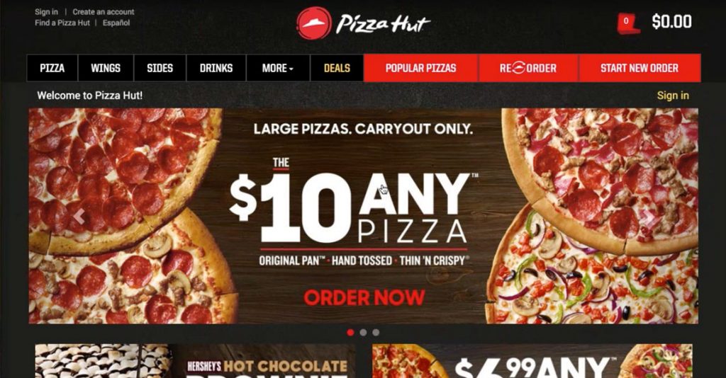
This is the homepage. Pizza Hut has definitely spent some money on design, the dark treatment is slick. The slider is the main focus with great imagery calling attention to big promotions.  It does shift a little too often, I’d recommend slowing it down by 2-3 seconds. The menu bar has a lot of options and there’s even some hiding – Pasta, Salads, Desserts and Sandwiches are all under the MORE dropdown. This distracts focus for the users. Are Sides and Drinks really so popular on their own that they need first-level treatment? I’ve always thought of them as supporting characters. 

Both Popular Pizzas and Re-order caught my attention as Pizza Hut intended with the bright red background against black. I was disappointed when I clicked on Popular Pizzas and it took me to the same place that Pizza link did. I guess I was expecting something more exciting, maybe even a chart showing orders over the last 7 days, but it did it’s job and I clicked.

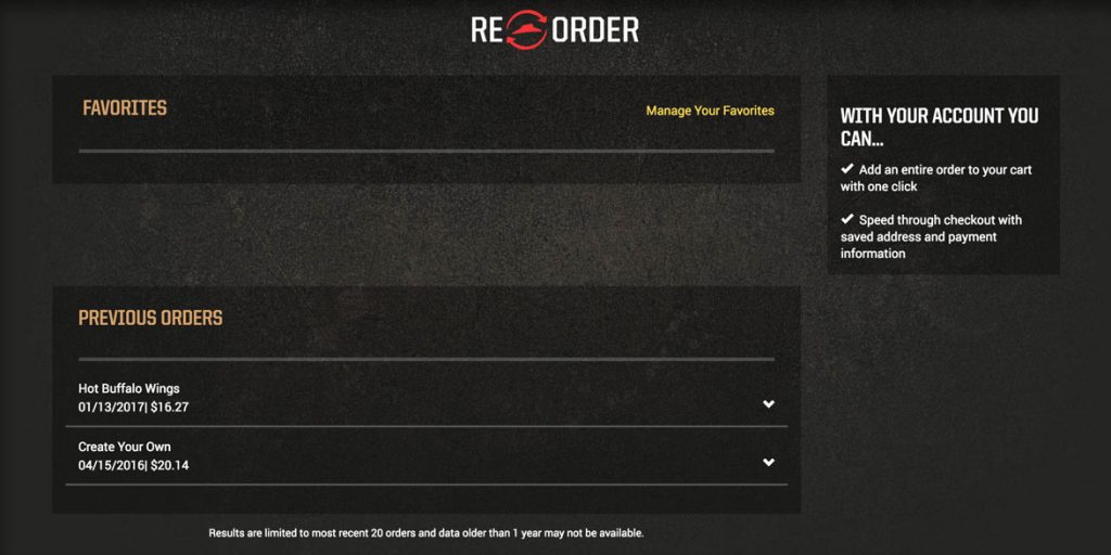
Reorder is a cool idea. It’s great for people that order the same thing a lot, but as a user with the screen above I’m not going to come back here even if I do order from Pizza Hut more often. This experience has left me disappointed.

A few ideas to improve this experience would be to add some of the most favorited items or orders from all users under favorites and invite people to favorite one of them, instead of leaving it blank. Or add a favorite button next to the previous orders so I can start to engage with the idea of favorites. Again, a cool idea but it’s lackluster for a new user or first time returning user, but could be a chance to engage them and earn cool points. A simple solution is hide this from first time users all together and filter them into the site more tactically. 

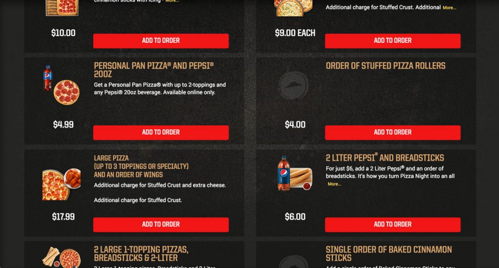
I always look for the deals or specials on the site, first thing. For Pizza Hut, Deals is camouflaged. It’s sandwiched between the bright red buttons and the white links. And it’s gold, which blends in as your eye passes from the two bright portions of the menu. Regardless, I click Deals and we’re off to the races.

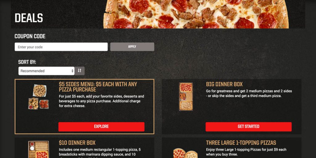
The page is two columns and each box is standardized with the button in the same place, a place for text and a small picture. The pictures look nice but they’re awful tiny. I’d scale them up and show them off. We picked Big Dinner Box and clicked Get Started…unfortunately getting started takes a bit of work.

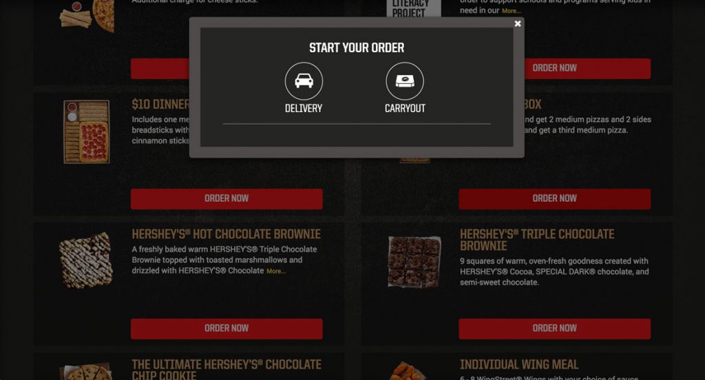
This pop-up asking the user if they want Delivery or Carryout is the starting point. This doesn’t make sense here. Does it really matter until my cart is full and I’m ready to spend money? When I click order now I should begin building my big box so I get invested in my order.

Maybe Pizza Hut needs to know where I live because some locations have different items than others. If that’s the case, encourage the user to “Find Your Pizza Hut store”. By making it their store you provide a subconscious connection to add another level of investment and get the info you need in a low friction way.

We clicked delivery and…

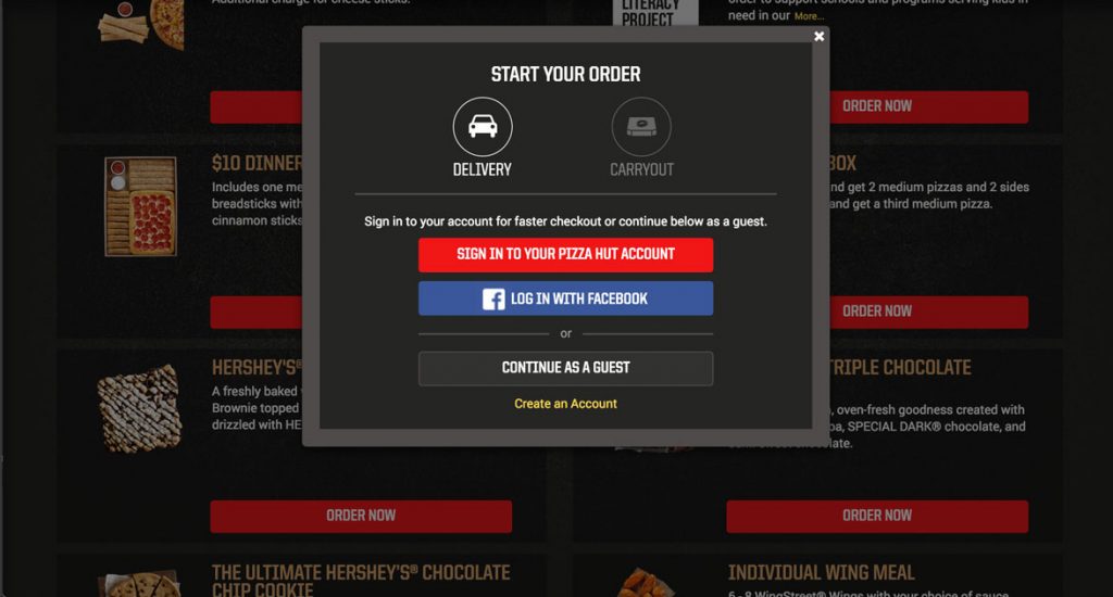
What’s this? I understand signing in for faster checkout…at checkout, but not here. Let’s get to building my box.  I’ll just try to Continue as Guest so I can start building.

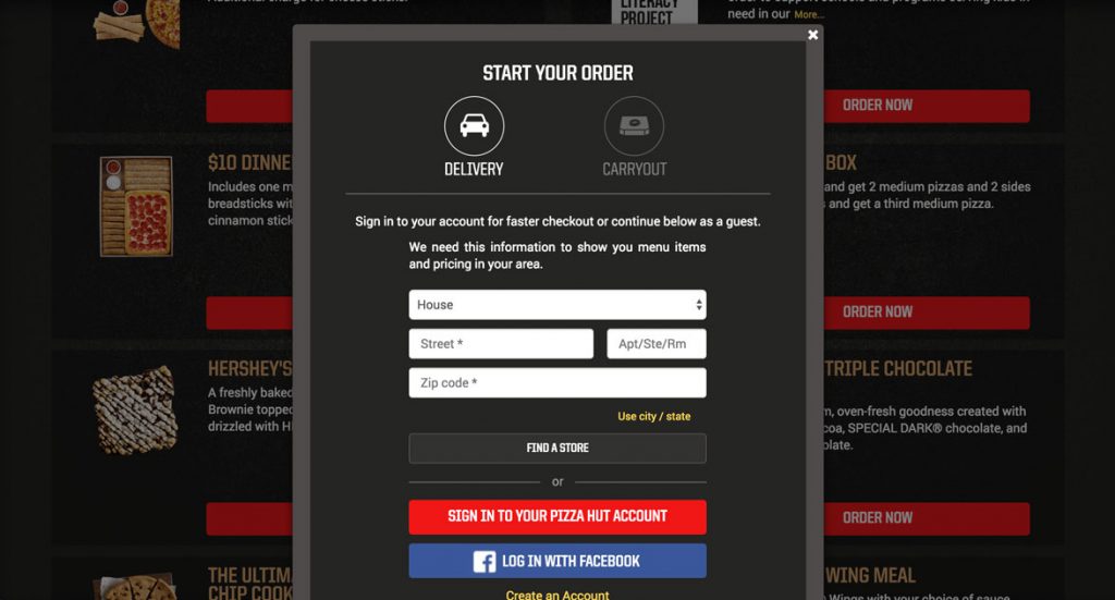
Now they tell me: “We need this information to show you menu items and pricing in your area.” Ok, since I’m not going to get around this quickly I’ll just log in with my account.

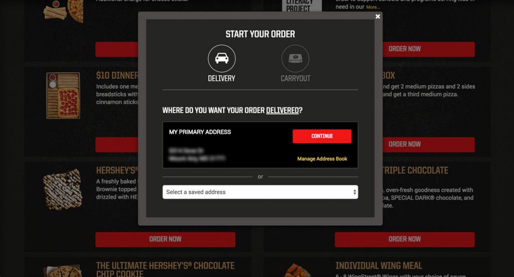
Yep, that’s my address and I’m ready to keep going. As a side note I do like the select a saved address drop down to make it easy for users to order from multiple locations, but I would style it to match the rest of the site. 

Continue!

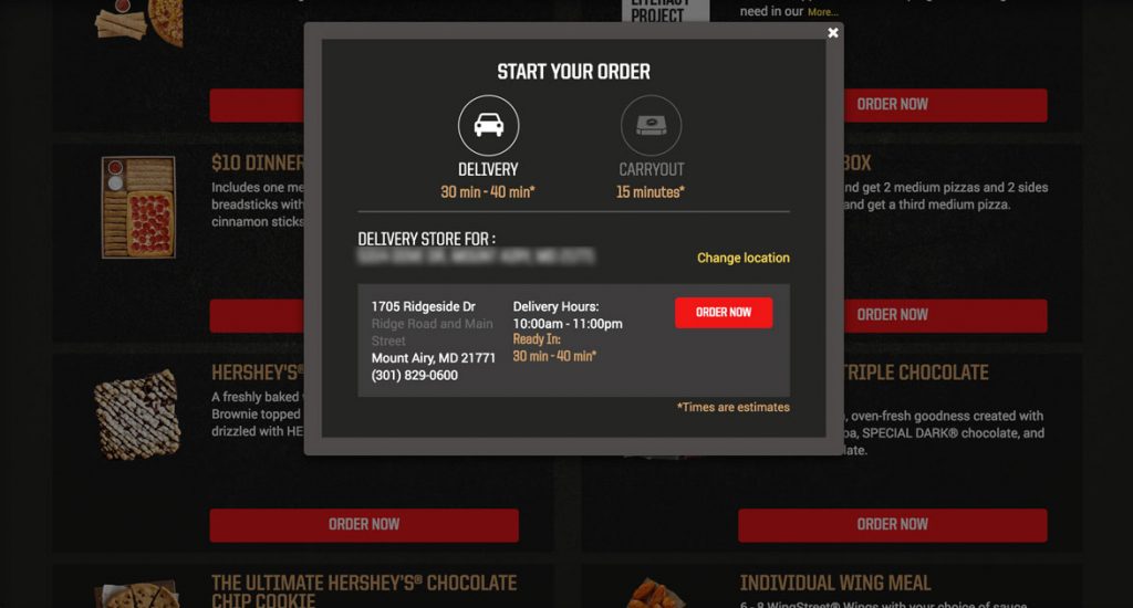
What? Another confirm? Seriously, I just want to order my food. I understand that Pizza Hut wants to make sure the delivery time is okay with me, but I would only show a screen like this if the order time is much longer than normal with a message like “We’re really busy right now and order times are longer than normal. We just wanted to let you know.” 

Let’s get to it…Order Now!

And after all that I’m dumped back onto the Deals page…what was I ordering again?

After all of that I should be pushed into the creator so I can start building my Big Box, but I’m left here in the middle of the page waiting for something to happen. It’s frustrating and at this point I’m thinking about checking out the competition.

I scrolled back up the page, found the Big Dinner Box and clicked Get Started…again.

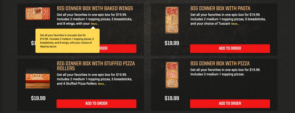
I was taken to another page with different options, which is awesome, kinda like Tetris but with food.

Instead of an Add To Order button they should say Customize or Add and Customize…something that lets me know that I’ll get to make adjustments prior to it being thrown in my cart. Also, a little nit picky but I don’t understand why they have the character limit on the description with the More… link when the text that’s missing could absolutely fit in the space. I thought it might be for responsive purposes, but scaling the screen down shows that they pick different character limits at different screen sizes.

Onward…Add to Order.

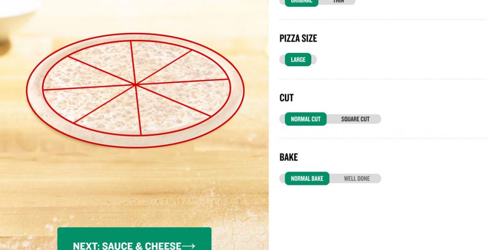
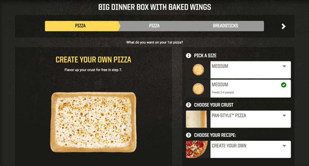
This screen looks really nice. It’s got the pizza on the left and a step by step process on the right. One update that could be made is to identify if there is only one option like under Pick a Size shown in the image above and instead remove the dropdown and say One Size. Not a big deal, but it shows you’re truly tailoring the experience.

A big win for this creator is that the pizza stays vertically centered on the screen no matter how far I scroll down. It’s what I was looking for with Papa John’s and I was really happy when I saw it being done here.

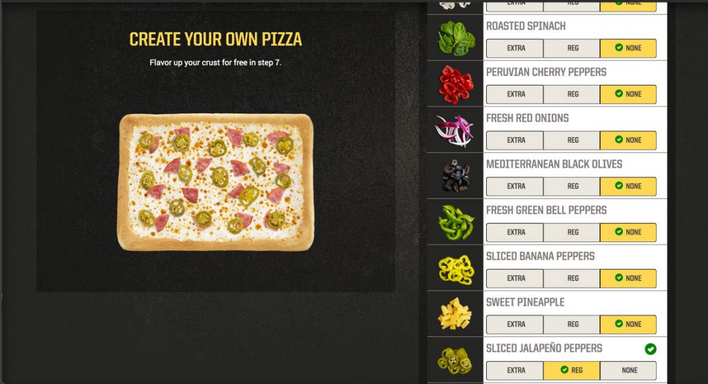
Pizza Hut’s solution for adding toppings are expandable menus, which while cumbersome is acceptable  because, the pizza stays centered. The menus have beautiful pictures of each of the topping choices and the ability to add extra which is a nice touch. When the toppings menus are collapsed, the toppings are a comma separated list. This could be cleaned up with a bulleted list, which would lengthen the box but make the topping choice much more clear. 

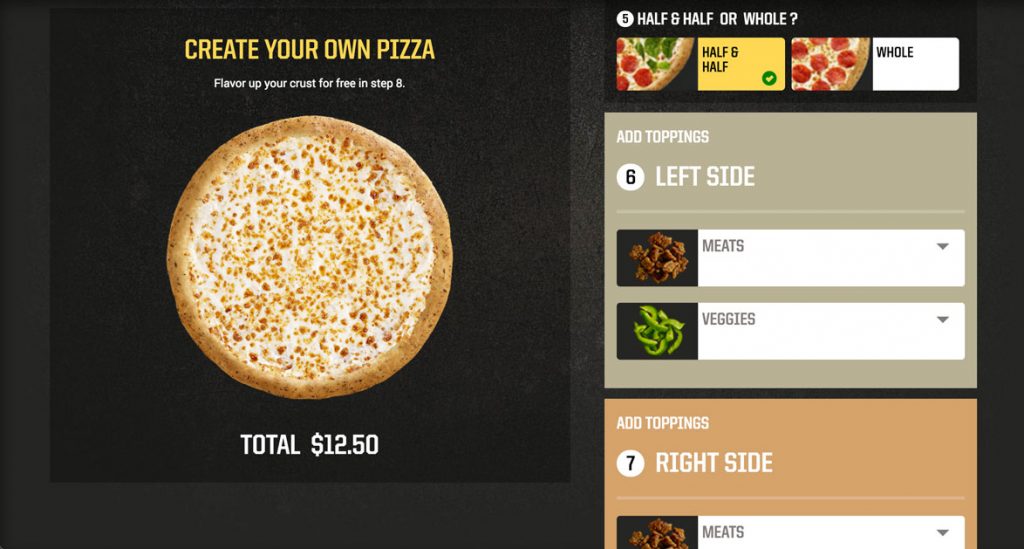
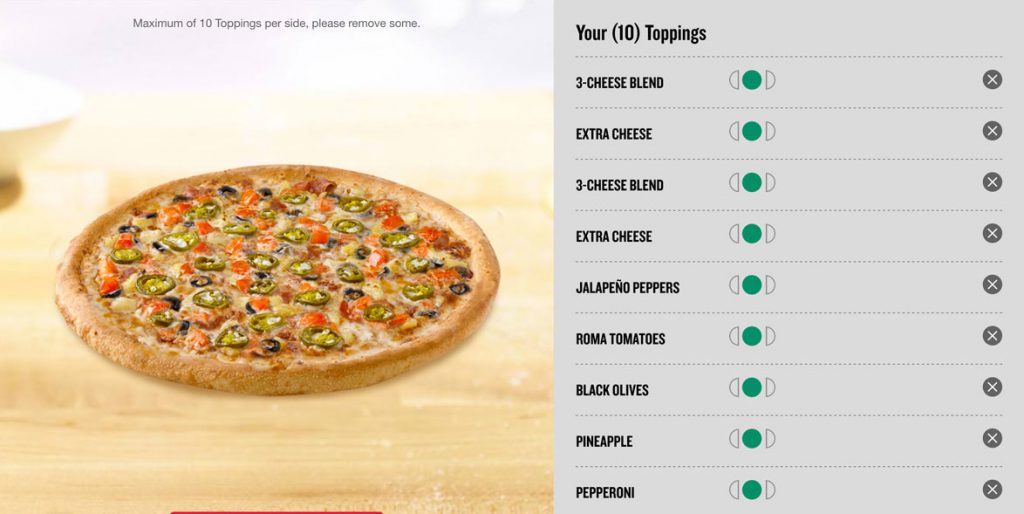
There was no way to do half toppings with this type of pizza, so I built another pizza and their solution is to make it a menu choice and then breaking down adding toppings to each size rather than an iconic representation. It gets super long when you start adding toppings. It seems like a quick hack way of handling it rather than thinking through the design of the problem and implementing a well thought out solution.

When you pick no cheese, the picture of the pizza updates accordingly, so I’ll put a point in the Pizza Hut column for that one.

When you scroll through all the steps and get to the bottom in order to move onto your next item Pizza Hut presents you with a summary of your order which I glazed over but upon second glance it’s a really nice touch (and they push the upsell of extra cheese again, so kudos there as well). Overall a really solid experience, cleanly designed and intuitive.

The rest of the Big Box was more of the same so I’ll jump ahead.  

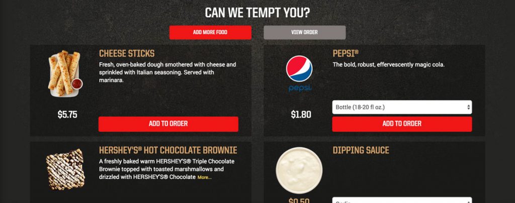
After finishing up I was taken to the “Can We Tempt You?” page. It provides some options to add to my order and also gives me a clear way to continue shopping (add more food) or to view my order…but it’s gray. Gray means disabled, so while this is an active button I recommend changing the color, perhaps the gold or a red outline with red text.

They included buttons at the top and also at the bottom below the temptation options, which is great, so I can proceed to giving them my money. I clicked View Order and was taken to checkout.

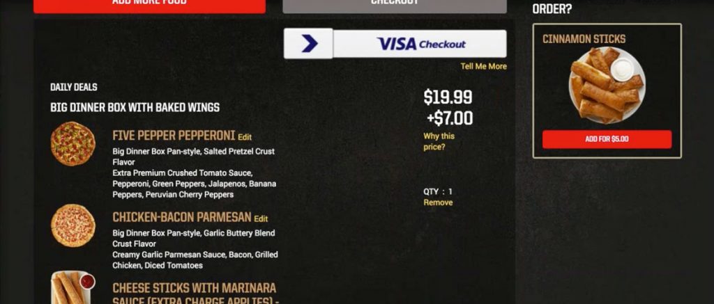
There were additional charges to the Big Box because of specialty pizzas, adding cheese to the breadsticks and other upgrades. Pizza Hut very clearly shows this as $19.99 + $7.00 and gives the user a “Why This Price” button. Unfortunately there is no clear breakdown of exactly what caused the 33% increase in price, just a definition of the types of things that can increase the price. A better experience would be to list the exact items that are causing additional charges and allow users to remove them in order to reduce their price.

Pizza Hut’s standard pizza customizer (as shown above) constantly updates the price below the pizza as you add toppings or make other changes that affect the price. For the Big Box, they could simply add a price updater under the pizza, in order to bring it in line with their standard high quality pizza building experience.

The argument could be made that most users are going to get to this stage and pull the trigger and just pay the extra $7.00 without thinking about it. They’re invested after all. The flip side of that could also be true in that a user gets to this point and says, “I thought I was getting a twenty dollar meal and now it’s closer to thirty, let’s check out what Domino’s has that’s comparable.” By being transparent it eliminates this possibility and will inspire users to gladly spend more because they’ve been eased into it throughout the process.

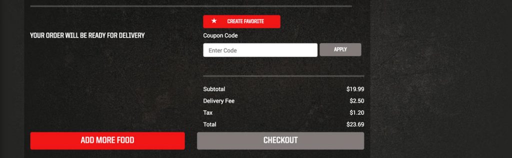
Even though the checkout button was also gray, the overall checkout was a simple two step process and they even asked for my birthday so they could send me a birthday treat, sweet! This is where the overall sign-up or sign-in should have been handled rather than earlier on in the process when I wasn’t yet committed, but because of all that up front work this was easy, but at the cost of a confused, frustrated first time user, which is when you need to get them to love you the most.

Overall Pizza Hut has a good experience, beyond the initial onboarding issues. The experience is well designed, clean and intuitive. The main menu bar could do with some clean up and adding half toppings isn’t optimal, but they are both functional as is. Another minor thing is the yellow box that pops up anytime something gets added to the cart which needs adjusting as it only flashes on the screen for 2 seconds and causes more confusion than help. For returning users and especially avid users this site is set up to make it easy to get in, order (or reorder) and get out, plus it looks good doing it. 

The Papa John’s Experience

By | pizza, ux | No Comments

In my last post I broke down The Pizza UX Challenge. You can read about it here.

In this post I dive into the user experience that comes with ordering pizza on Papa John’s (papajohns.com).  As I said in my last post, I approached the site as if I was a normal user (which I am) ordering pizza for me and my friends on a Friday night, using my 13” MacBook Pro in a Chrome browser.  

This is the home screen. It is clean, with a slider which promotes the current deals flipping between a great big picture of pizza and stuffed cheesesticks. Secondarily the red bar draws my attention to Menu, Specials and Papa Rewards. I almost completely miss the small menu items and the Enter a promo code form fill which makes sense in focusing your user towards the most important items. I’d be curious how many people are entering a promo code into this bar rather than just doing it at checkout.

Note: After a quick internet search I found a promo code which I applied here to receive 40% off a regular priced pizza, so this is something I’ll probably use in the future.

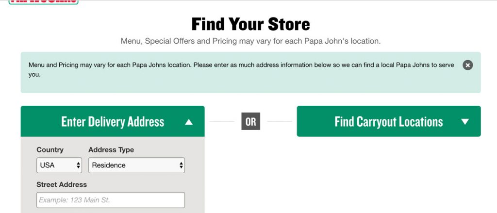
But for this user experience I clicked on Specials, because that’s what I would typically do on any online food ordering site, look for the deals. Papa John’s very clearly let’s me know that “Menu, Special Offers and Pricing may vary for each location.” so I need to let them know where I am. Makes sense to me. 

I also like that if I am carrying out I can just give them my zip code and not my whole address, it’s a nice touch for privacy. I enter my address, click Submit and am taken to…

…Menu, not Specials. That’s disappointing.

I even started scrolling down, was confused about the odd look of specials and had to click on the Specials menu item again.

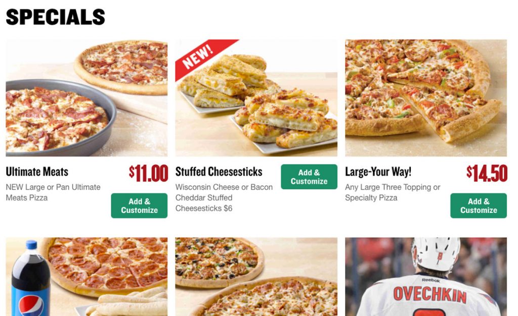
The Specials page is laid out in a 3 column view and looks clean, but with a slight modification could be improved by adding consistency to each item. Standardizing button placement as well as pricing would add uniformity to this page and give a better structure. Right now the buttons are positioned on the right, high and low, while some items have prices and others don’t. Also, letting the user click the beautiful picture as well as the Add & Customize button would be a nice touch. 

I clicked on Add & Customize for the Large-Your-Way! Deal. This opened up a new page with the options for specialty pizzas, from which I chose John’s Favorite and entered into the pizza customizer.

One thing that struck me right away with this page is the amount of screen real estate being eaten up by the top two menu bars which at this stage in the experience are unnecessary. As a user I am focused on creating my pizza and as a site designer I don’t want you navigating away from this experience, so it benefits both parties to hide these menus or at the very least shrink them significantly.

In addition, the step by step process indicator is larger than it needs to be. Beyond size, this progress indicator allows you to interact with the arrows on either side which takes you through each section (Size & Crust, Sauce & Cheese, Toppings). Each section seems as if it’s clickable, but when you click…nothing happens. Having a progress indicator in a wizard is a great way to show users where they are and how many steps are coming, but this one is suffering from a few problems. In order to fix it, put all steps on one screen, reduce the height and either make each step interactive or change remove the hover effect of a pointer indicating an interactive element.

One last note about the screen real estate. The font size for “Choose your size and crust” heading is huge. It doesn’t need to be this big. All together those four elements take up 57% of the screen so I’m forced to scroll down to get to the magic…

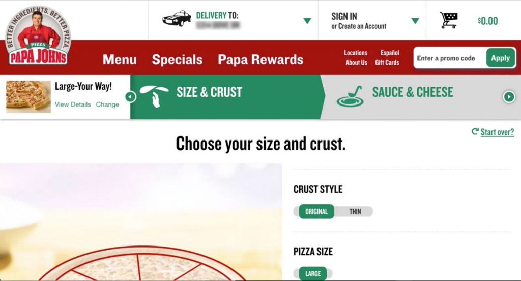
…and so I’m ready to start customizing the pizza.  The experience allows me to customize most anything I want and as I do so the picture of the pizza on the left to show off my updates.

It’s pretty cool.

But this too is oversized, so after I make my selections I have to scroll down to find the Next button. The pizza is floating in space on a heavenly looking counter and all that space could be shrunk in order to fit the pizza and the button on the screen at once.

When I do hit the Next: Sauce & Cheese button it shoots me back up to the top of the page and I have to scroll down again, and it does this with each step. Creating a holistic pizza building experience that resizes based on screen size would fix all of these issues. 

Aside from sizing, I only had two issues with the building experience, one big and one small.

The small issue is that if you choose no cheese, the pizza doesn’t update by removing the cheese from the picture. However if you change your sauce from Original to BBQ or vice versa the pizza does an animation showing you that the sauce has changed, then slapping the cheese back on, which is a nice touch. For users picking no cheese, not showing cheese would be optimal, but if that’s too much work, then at the very least tell the user that the picture does not represent what will be delivered.


The big issue is with the topping menu. I have four toppings chosen when I arrive (because of the specialty pizza I chose) but it only shows me two and then has a small call out to view 2 more. I know why they do this…to save space, but as this hasn’t been a priority with the rest of the experience why did they choose this as the place to show less information?

I do really like how easily Papa John’s allows you to pick half toppings and the graphic way in which a user can easily tell how the pizza is split up. The pizza even animates removing toppings from half. Also the presentation of the toppings, separated into Meats, Veggies and Cheeses with beautiful pictures is solid.

However, as I add toppings sometimes the pizza is only partially visible. If this is supposed to be the user’s focal point, the pizza should stay centered on the screen at all times no matter how much the right side grows or is scrolled.

In two instances I did things I wasn’t allowed to do. First, I added too many toppings (it tops out at 10) and then I took away too many toppings (you can only remove 2 toppings from a specialty pizza). In both instances a tiny error message was presented that I had to hunt for, because I couldn’t figure out why I was being stopped. It was tiny text above the pizza and both times it was actually off screen when it occurred so my experience just stopped working. An alert pop-up or a red message bar that sticks to the top of the screen would be much more noticeable and not leave the user feeling confused.

To be fair, Domino’s nor Pizza Hut had anything better when it came to adding toppings to the pizza, but I’ll cover that in their breakdowns. It’s an interesting design challenge that I’ll tackle in a future post.

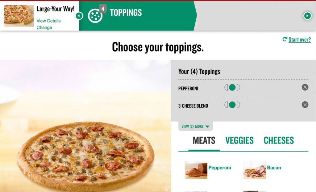
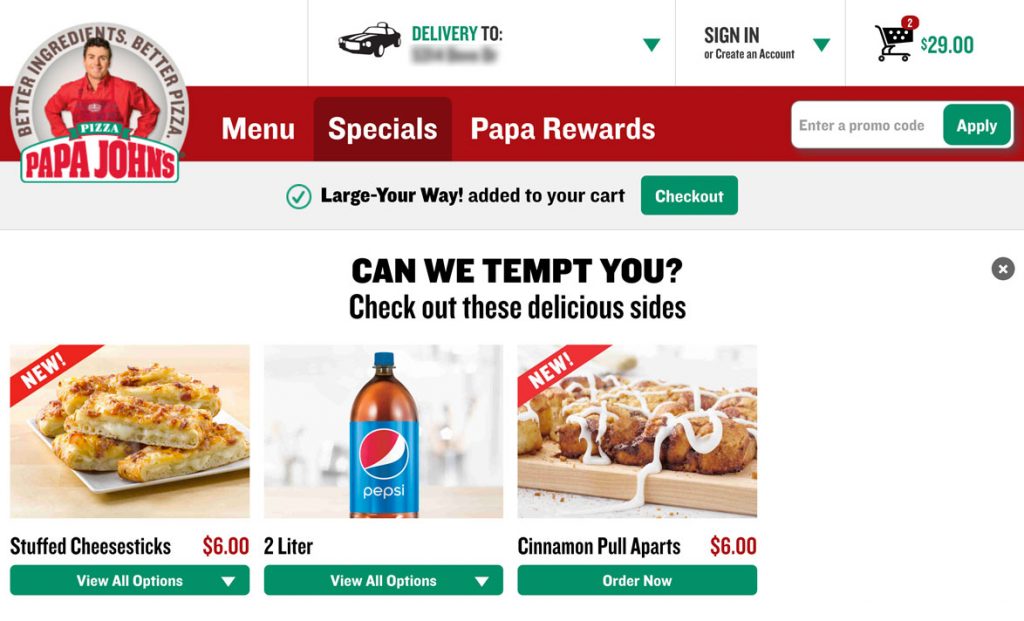
After finalizing my pizza customization I clicked the Add To Order button and was taken to a screen asking if I can be tempted with other offers, which is great. It’s a good time to upsell users.

Right below the main menu a message pops up “Large-Your-Way! added to your cart” with a green checkout button. I scrolled down the page to check out the other offers, but then when I scrolled back up the checkout button was gone. I went through the experience again to see what happened and after about 10 seconds this bar disappears leaving me in temptation limbo.

This shouldn’t happen. I’m not going to buy more now because I got stuck on this page. In fact, there should be an additional checkout button added below the temptation items as well to give me a clear path to get to the checkout when I’m ready to hand over my money.

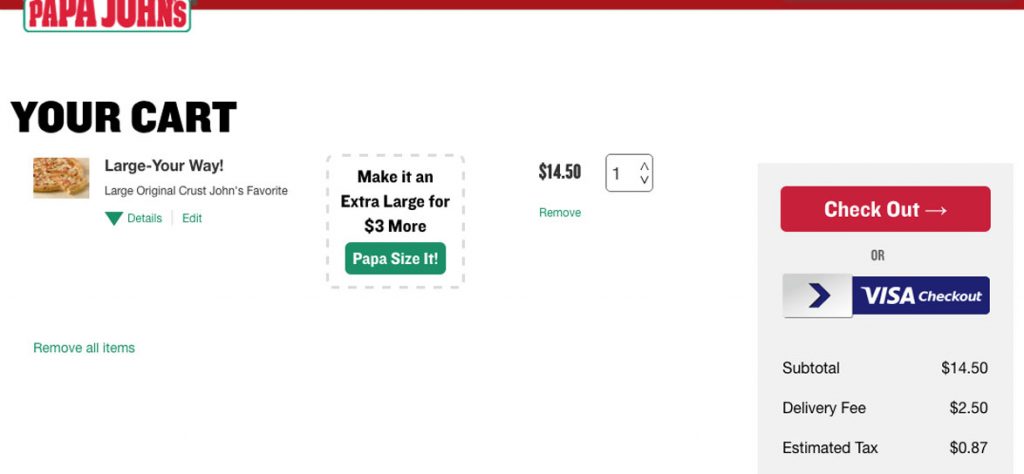
I ended up clicking on the Cart icon in the upper right corner. The cart could use some help with spacing as well, but I think I’ve covered that enough.  The Papa Size option is a nice touch. Overall this has everything I need and I quickly hit Checkout

For me, I already have an account and would like to sign in but my reaction was to begin filling in this information and then after a few keystrokes realize my mistake and look for the sign-in prompt. This could be avoided by moving the green sign-in button right under Tell Us About Yourself. I couldn’t miss it then.

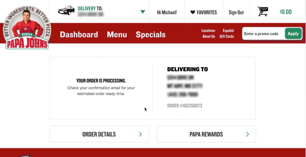
And the last few screens step you through the finalization process very smoothly and easily.

Boom! My pizza’s on the way. It would be nice to have some sort of update on the site itself instead of having to check my email, but I have no complaints about this experience. It works.

Overall, ordering from Papa John’s is easy and I only felt lost once, when I couldn’t find the checkout button that disappeared on me. There’s more scrolling than there needs to be in some places and the main navigation of the site could go on a diet (maybe it’s eaten too much pizza), but it never hindered me from getting to my end goal.  Rather it just made me think and click a little more than I should have to, which is exactly what you want your users to avoid doing – thinking too much.

This feedback is just from one user run through, which I hope helps to show the value of user testing and iterative design in order to get the most streamlined experience you can, because at the end of the day a better experience means happier customers and happier customers means more pizzas sold.   

The Pizza UX Challenge

By | pizza, ux | No Comments

My last series of posts were about conducting usability studies on your product in order to optimize the experience for the end user.

In order to put myself in the users seat I decided to conduct a study on something millions of Americans interact with every week: PIZZA.  There are 3 billion pizzas sold every year in the US alone which breaks down to 11.5 million pizzas every day. Papa John’s sells 350 million pizzas a year and 50% of those are done either online or through their mobile app.

I love pizza. It’s probably my favorite food and would eat it every day if I wasn’t concerned about my heart exploding. 

I decided to order from the three national chains near my home in Mt. Airy, MD (which is about 40 minutes outside of Baltimore), all in one night. Along with two of my friends we went through each experience and I’m going to break down what worked and what didn’t.  

I approached each website as if I was coming to their page as a normal user, recorded the session and noted any positives/negatives in the experience. This analysis does not take into account mobile web or mobile/tablet app experience. I did confirm that the tablet web experience was identical in all three cases to the experience on my computer. The obvious exception being a touch interface which could offer slight variations in experience.

With each site I was able to complete the order and like magic, 20-30 minutes later there was delicious food at my door.

The biggest surprise was that none of them had the experience as fine tuned as I originally thought they did. Or put more succinctly, there were more mouse clicks to get to where I wanted to end up than I remembered there being…and in one case it was almost painful.

The Breakdown

The places: Papa John’s, Pizza Hut, and Domino’s

Time: Friday night between 7:30 and 8:30pm

Order method: 13” Macbook Pro, Chrome browser

Hypothesis: Prior to running the experiment:

  • Users will be able to easily add a pizza to their cart and checkout quickly
  • All the experiences will be fairly similar
  • Only minor UX issues would present themselves

Additional facts:

  • I already had accounts with all three, so this does not judge the sign-up process, only the ordering process
  • I order most from Domino’s because the offer a gluten-free option and my wife has Celiacs, although Papa John’s has my favorite pizza and my son loves Stuffed Crust from Pizza Hut

The next four posts will be as follows

As they are posted I’ll update the links here.

Pizza facts:
http://expandedramblings.com/index.php/papa-johns-pizza-statistics/
http://www.thepizzajoint.com/pizzafacts.html

What to Expect in the Usability Report

By | implementation, user testing | No Comments

From the first four posts in the series you now know the What, When, How, and Why of Usability Testing, centered specifically on User Testing.

When the test is done you will need to analyze the data from the test and write up your learnings. This is the usability report. If you’re working with a researcher like myself, then this is the deliverable that you will receive which breaks down the test and ultimately makes the recommendations for next steps. If you’re conducting the test yourself you should still take the time to write down your findings, even if it’s not quite as formal.

Summary
The summary should be a one page overview of the test that the stakeholder can review and have all the relevant information. This includes why you chose to perform the test, how many participants were tested and what persona(s) they fall into, the date(s) the test was performed on, and the key takeaways.

Introduction
The introduction is a more in depth continuation of the summary explaining an overview of the decisions that brought you to the particulars of the usability test with details. An overview of usability testing and the steps you took prior to conducting the test.

Key Hypotheses
List the 1-3 hypotheses you made prior to executing the test. For example:

  • Users will be able to easily navigate from the welcome email into their account
  • Users will be able to buy a shirt after entering the home page
  • Users will be able to find and contact support

Goals
Now that you’ve conducted the test, what goals are you hoping to achieve?

  • Through a series of iterations, we will improve the comprehension of the data being presented by 80%.
  • Through a series of iterations, we will lower the user’s lostness score to below .2.

To read more about lostness score, read this Medium post by Shane Doyle.

Participants
Give an overview of your participants and include their demographic data and interview questions. If you have enough disparity add some pretty charts and graphs to show how they compare to one another.

Methodology & Scenarios
Some people seperate these into two sections, but I prefer to stick them together. Write up which testing methodology you used and then in a number list write up the scenarios you asked the users to walk through. You can copy them directly from the script you wrote for the test.

Results
This section is broken down into four major parts:

  • Task Completion – A write up of each task and what the rate of success was for each user. Normally in the form of a table, followed up by detailed paragraphs.
  • Errors – any bugs that were found during the test.
  • Key Takeaways – Same as in your summary, the key learnings that you found in the test.
  • Notable quotes – one of my favorite parts. All those gems that your users spit out without even realizing how valuable they are. List them here. Mine tend to be a little longer than others I’ve seen because I’d rather have too many to pick from in the future than not enough.

Recommendations
The longest section by far. This is where you list all the problems you came across (beyond the key takeaways into the nitty gritty) and your recommendations about what to do about them. How I typically list them is:

  • State the problem – one sentence explaining the problem.  I also include a color-coded severity of the problem Low (green), Medium (orange) and High(red)
  • A screenshot for reference
  • Detail – an in-depth overview of the problem with reference to the participants issues
  • Recommendation – may include a simple wireframe to go along with the text recommendation
  • Additional comments (optional) – if there’s something beyond the recommendation that I feel needs to be addressed I’ll put it here

You repeat this until you’ve covered everything that has come up in the test.

Conclusion
This is usually 2-3 paragraphs analyzing the effectiveness of the test and suggestions for any next steps after the recommendations are implemented.


There you have it, a report to go along with all your hard work. As I recommended in the How portion of this series, UXPin has some great templates, including one for the report.

Next up: Pizza.

Why To Adopt Usability Testing

By | user testing | No Comments

I get jolt of pleasure followed by a knowing smile from the reaction stakeholders have after their first customer interview experience or user testing session. It’s an a-ha moment. Happiness and then a flurry of the learnings and improvements they just picked up. And that’s after just the first one.

You want to run usability tests to optimize your user experience in order to optimize your bottom line. Creating a site or app that is intuitive for your user in turn creates a happier user. You need to understand the path that users are taking in order to achieve success and smooth out the edges. The less they need to think, the happier they’ll be and the more they’ll buy. Remember, product success is when your customer is successful.

My favorite learnings are the ones which leave me feeling a little stupid. A user will be walking through the site which I know very well at this point and will ask something like, “I understand that this button adds it to my cart, but why can’t I immediately go to my cart?” In building a product you can start to have tunnel vision towards your own ideas, but a good user test will help you to put a wider lens on your camera and expand the vision of what you’re building.

The biggest example is the story of the $300 Million button. Jared Spool explains how removing a user’s need to create an account in order to purchase from a large online retailer increased yearly sales by $300 million. He found out that the original hypothesis that users wouldn’t mind registering for an account was wrong and most did so with a sense of despair. They removed the register button, replaced it with a continue button and number of customers purchasing went up by 45%.

This is the power of usability testing.

One more in this series, centered around the usability testing report. Then onto a case study about ordering pizza online from three of the biggest chains.

Want to read more about usability testing? Leave a comment and let me know.

How to Run Your First Usability Test

By | implementation, user testing | No Comments

In my last two posts I wrote about the What and When of usability testing. Today I’ll be running through the How for first time testers.

There are a lot of different ways to study the usability of your product and depending on the situation you want to adjust your approach accordingly. The most useful place to start is with user testing and the great part is that there are some quick and easy steps so that  anyone can do it.

From a high level, you’re going to get users that are representative of real-life users, give them tasks to complete that real-life users would complete and watch what they do and how they do it.  Take notes, communicate what you see to your team and already you’ll have a better product. To do a slightly more formal study dive into the steps below.

Define Your Goal
First, what’s your goal? Just as you’ve defined the goal of your product, in turn you need to understand your goal of the test you’re going to perform before anything else. For example:

Can users find out about my consulting services?

Which method do users use to find a product in order to put it in the cart?

The important part in defining this is to create focus around the most important aspect of your product to test. The wider your testing lens (the more things you try to test) the more time a user has to begin learning your UI and creating skewed results. Remember the goal is to get a user’s initial reaction, not hoping they figure your UI out.

Create the Tasks
The next step is to define the tasks that you want the users to perform. What steps do you need them to take in order to achieve your goal?

Goal: Can users find out about my consulting services?
Task: Use the website to find out about any consulting services.  

Goal: Which method do users use to find a product in order to put it in the cart?
Task: Use the website to purchase a shirt for under $30.

Define Your Users
You need to understand who is going to be using your product. List out their primary characteristics so that when you go out to recruit subjects to help with your testing you can try to match as closely as possible to what a real-life user looks like. Some products have multiple users who will use the product differently. If that’s the case make sure to focus on the correct personas for the test you’re running. If multiple groups will need to achieve the goal you’ve laid out, make sure to get representatives from each set.

Write Your Plan
There are many good reasons to write your plan down, but the two most important are to make sure the stakeholders understand what you’re planning on doing and are on board and to have a clear layout throughout the testing.  

I still use this sample plan as a template when I conduct a user test: https://www.smashingmagazine.com/2012/01/ux-research-plan-stakeholders-love/#a-sample-ux-research-plan

And for the script part I always start with this: https://sensible.com/downloads/test-script.pdf

Although over time mine has evolved into more of my voice and shifts based on what type of product I’m testing.

In addition UXPin has put together some great documents which you can find here, including a video consent form and a checklist for test day. They are a good starting point but definitely recommend making them your own.

Recruit Users
This is often viewed as one of the most difficult parts of the overall process. Finding the right kind of users (as you’ve defined above), scheduling times and preparing the documentation. For this, try to find users that are as close to real-life users as possible but don’t be super strict. Find friends, family or co-workers that fit the bill and ask them to do you a favor, especially if this is your first time through. Also, if you have existing users that’s how I’ve done the majority of my testing throughout my career.  They’re often more than happy to contribute to helping especially if they’re a fan.  

This article does a good job of laying out ways to recruit different types of users.

Conduct The Test
You can run the test face-to-face or over a screen sharing service. I’ve used usertesting.com in the past and in my most recent study used Go To Meeting, which worked well and was cheap.

Regardless of your proximity, address the user by name and thank them for their time. Make sure they are comfortable with the platform and then run through your script.

When it’s the user’s time to shine, say as little as possible and don’t answer any questions that might guide them to an solution that you’re hoping to find through the testing.  Let them know you’ll answer that question when the test is done or that you want to see how they work it out for themselves.

Once you’ve gone through all of the scenarios, ask any questions through what they saw or as follow up to the tasks they’ve just performed and make sure to give the user time to ask any questions of their own.

Write the Report
Using your notes and reviewing the video make an outline of the improvements that could be made to the site. Mark each change with a priority level and include both written and sketched suggestions so that you can add it to your next sprint or planning cycle. If it’s helpful you can even edit sections of the video to share with the engineering or designers so they can see the problem first hand.

I like to create a folder on Google Drive and include all the videos, the initial write-up and the final report along with a file linking to any stories or tickets I’ve created.  

As I said early, there are many other types of usability tests which I will go over in a future post, but for now you’re armed to go and run a user test and improve your product.

What else would you like to know about user testing or usability studies? Let me know in the comments.

Are you interested in having me run a usability study for you? Contact me.

When Should I Do Usability Testing?

By | product, strategy, user testing | No Comments

In the last post I explained what a usability study is. If you haven’t read that, check it out here.  

Today I wanted to focus on when to do a usability study, but before we dive into that let me first address what types of products benefit from a usability study.

When I talk about usability studies I’m typically focused on tech products which I group into websites, web applications, native applications or mobile apps. I do believe there is benefit in bringing in the user for other types of products during the entire lifecycle and getting feedback along the way as you design and build, whether that be something physical, like the next great widget or something like a book, which Ash Maurya lays out in great detail in his book Running Lean (for that very book).

Bringing it back to tech products my answer would be that they all benefit from usability studies. I like to focus on the low and high end of complexity as use cases and letting the middle sort itself out, so in that spirit let’s break it down:

Low complexity
A portfolio website to show off your artwork and increase consulting work. Surely you don’t need to do any usability testing. It’s straightforward, here’s some beautiful design work and here’s how to get in touch with you. Boom, done. My counter argument to that line of thinking is, what if you could increase the amount of consulting work you get by 10% with a few hours of work? How about 50%? By putting the site in front of people with the task of hiring a design consultant you could discover that they want to fill out a form rather than call or email you. That small change could increase your rate of return.

High complexity
An advertising platform that allows advertisers and publishers to manage their accounts in real time. This would be a web application with a mobile component that allows  both external and internal users different levels of access. With this type of product you would have many levels of usability testing. From a persona level you have advertisers and publishers, all of which are probably not the same and would need to be broken down into sub groups. Even within those personas it’s often the case that users will need different levels of access, such as the Sales Executive and the Ad Buyer. That’s without yet considering how the internal account managers will need to impersonate users and have their own switches and levers.  

Putting these products in front of users is crucial to saving time and money as you’re building and maximizing profits after it hits the market.  

But when do you put it in front of users? When is the right time to do usability testing?

The short answer is, throughout your entire process, from discovery to design, through development and even after launch.

In Tom Chi’s talk on Rapid Iteration (which I posted back in December) he says, “For everyone who builds products, the real medium is human behaviour in the real world, and your purpose should be…to see that human behaviour modified by what you build.”

The longer answer is that the more usability testing you can achieve during your product creation, the better. In Tom Chi’s talk he mentions a feedback loop of only a few days, constantly giving feedback to the design and engineering teams. That is a high bar to reach for indeed.

Instead, breaking the project down into Discovery, Design, Development and Launch we can start to identify the points at which usability tests can be effective, even if we aren’t on a bi-weekly cycle with our feedback loop.

Discovery
Product discovery starts with understanding what you’re hoping to achieve. See my post on setting your product vision. Involving users at this stage typically means conducting user interviews or nothing at all. One thing you could do as you’re qualifying your intuition is put users in front of similar products and gain insight from how they interact.

Design
During the design phase I encourage iterative design and adding in parallel design if you have the time. Iterative design is the process of taking user feedback on a design and updating it with marked usability improvement with each iteration that you do.  Parallel design starts with multiple concepts and takes the best from all three to end up at 1 design to start the iterative process from.

You want to work through as many cycles as you can, continually gaining insight from users, before a line of code is ever written. In this great article on the Nielsen Norman Group website it goes through the details of each of these projects and state “there’s no one perfect user interface design, and you can’t get good usability by simply shipping your one best idea. You have to try (and test) multiple design ideas.”

Development
During this phase UX, design and engineering should be talking every day about progress of the project and UX should be thinking about what they’re going to test on a weekly basis. In the video from Tom Chi above his team does it twice a week. Do what you can, if you can only do it once every two weeks it’s better than not at all. By taking what engineering is building and putting it in front of users and finding the flaws (and really awesome stuff) as you’re building it will save you from huge rewrites and updates after launch which saves your team huge amounts of time and money.

Launch
As I wrote about a few days ago, when you launch you’re not finished, keep pushing towards your goal that you set up at the beginning of the project and while now you will have quantitative data coming in through the many users you have hitting your app or site on a daily basis, it’s also good to sit with your customers and understand how they’re using it in the real world and continue the loop of improving so you can more quickly hit your goals.

In the next post I’ll discuss How to Conduct a Usability Test on the cheap and if you’re interested in having someone take care of it for you, contact me and maybe we can work together.

What is Usability Testing?

By | implementation, product, user testing | One Comment

Over the next five posts I’m going to be outlining usability testing, specifically in regards to building websites, web applications or mobile apps. I’ve been working with a few different clients and partners recently and found myself explaining the ins and outs of why, when and how to run usability tests, which inspired a deeper dive and in turn this series of posts.

Usability testing is a process which allows you to validate your product’s ease of use with real users. Users are asked to complete tasks to see how they expect the product to work and uncovers any areas where they experience confusion or frustration.

A few example tasks are:

  • Use the website to purchase a shirt for yourself (for an ecommerce site)
  • Log-in to the web application and identify your balance for checking and savings accounts (for a banking web app)
  • Download the app from the app store and take a picture (for a mobile photography app)

During these tests users are encouraged to think aloud, explaining what they see and the decisions they’re making as they are progressing through the task.

Usability tests can be moderated or unmoderated and there are benefits to both and times in which you should use one over the other.

Moderated testing allows you to lead the user through a series of situations and if they get off track you can gently guide them back to the end goal at hand.

For my first round of testing, I like to use moderated testing in order to meet some of the users in person and have a conversation which can lead to other insights beyond the task at hand.

Unmoderated testing is typically cheaper and can be done using existing online tools. Some of these tools can help you find users for your test, which can be a sticking point to usability testing in general.

Another benefit of unmoderated testing is removing bias that the moderator can unintentionally cause in the user. Known as observer effect (Hawthorn effect), individuals modify or improve an aspect of their behavior in response to their awareness of being observed.

Usability testing can (and should) be used in a variety of ways during the product lifecycle. In the next post I’ll go over what kind of products can improve through usability testing as well as when to run usability tests.

Understanding Where The Finish Line Really Is

By | product, vision | No Comments

I’ve worked on far too many projects that were treated as if the feature launch were the end of the project. Hooray, the feature is live and now we can get onto the next thing on our list. It’s the way it was done for a long time and truthfully it’s the way a lot of companies still build products today.

Just like many things, the first step towards fixing a problem is admitting you have a problem.

Over the next few days I’m going to be writing a series on usability testing, the what, when and how of it all, but as I was planning out those posts it got me to thinking about this issue that I know is still plaguing companies. Teams are agile and scrumming and running sprints, all towards this illusion of being done.  But when do you really know that you’re done?

The definition I use for done is when the customer is happy and the most important metric I’ve been tracking towards has been hit. Those two things tell me I’m done, not a feature release date. I like to think of the feature release date as a baton handoff in a relay race. If all has gone well this is the second such handoff. The first such handoff should happen after testing and experimenting during the design phase as I shift over to the development phase with the engineering team. That is not to say that all teams shouldn’t be involved during all phases of the process, in fact UX, design and engineering should be communicating all along the way, rather it’s just the phase of the project you’re in.

After the release of a feature you should be checking your data to make sure that it’s in line with the hypothesis you made prior to launch and allocating proper resources in order to make changes necessary in order to move the needle towards your goal. The resources used during this step should be greatly diminished from the major push which was just completed, but the problem is that many companies allocate no more time on the completed feature. That is why there is no true learning and features that are not contributing the way they should to the overall product.

It could take you months to drive the numbers in the way you need them to go, but keep making small tweaks and changes and follow the data. Once you feel like the feature is performing as expected and adding the value you originally intended, then it is time to move it over to maintenance mode.

Maintenance mode is a point at which further investment into improving your numbers will be a waste of resources, delivering diminishing returns, so at this point you set a goal (maintenance goal) in order to verify that the feature is staying the course and not dropping, but with little support.

Would you like to know more on how to have these conversations and begin to create a culture of learning? Let me know in the comments below.

How We Start and End Our Days

By | daily rituals, self-improvement | 2 Comments

I have two amazing little people that live in my house with me. My son, seven and daughter, five. For the past few years on the way to school or as I’m leaving for work I ask a simple question of them both:

What are you going to do today?

The first time I asked it was met with, I don’t know or go to school or overall disdain. I knelt down and said, “No, you’re going to be awesome.” As kids do, they’ve evolved it to a deep breath followed by shouting as loud as they can:

BE AWESOME!

Sometimes my daughter takes it in the other direction and whispers it as quiet as she can and I have to ask, “What was that?” and she’ll get a little louder each time I ask until she bellows it out.  BE AWESOME!

Then a few months ago, after jumping into gratitude with both feet I started asking at the dinner table, “What are you grateful for today?” We go around the table three times and everybody has to say something different. Usually the answers from the kids are about family or our pets, but as it’s evolved they have picked up some of the other things to be grateful for that my wife and I list.

In December, we lost my brother-in-law to cancer and so that night I said I was grateful for the health of my family and the fact that we were all together at the table. My son has since said he’s grateful that he’s healthy a number of times. And kids being kids they’re grateful for Pokemon and Shopkins as well. As it should be.

I feel like starting the day with a declarative statement of awesomeness and ending the day with a reflection of what they’re grateful for is, on the surface, irrelevant to them, I mean, they’re kids. But in the years to come and through repetition and consistency these messages will start to become part of who they are. What are they going to do today? Duh, be awesome. What are they grateful for? This amazing life that they have and even in darkness there is light to be found.

Of course, these two small things are just bookends for the love and lessons that we share with them in-between, but they’re pretty AWESOME bookends.

What daily routines do you do for yourself or for your kids? Let me know in the comments below.