In my last post I broke down The Pizza UX Challenge. You can read about it here.
In this post I dive into the user experience that comes with ordering pizza on Papa John’s (papajohns.com). As I said in my last post, I approached the site as if I was a normal user (which I am) ordering pizza for me and my friends on a Friday night, using my 13” MacBook Pro in a Chrome browser.
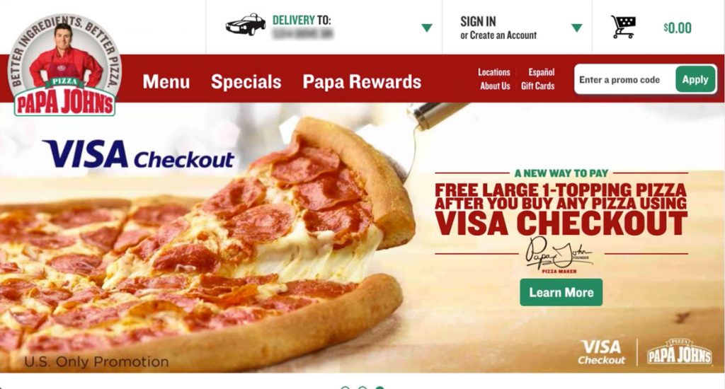
This is the home screen. It is clean, with a slider which promotes the current deals flipping between a great big picture of pizza and stuffed cheesesticks. Secondarily the red bar draws my attention to Menu, Specials and Papa Rewards. I almost completely miss the small menu items and the Enter a promo code form fill which makes sense in focusing your user towards the most important items. I’d be curious how many people are entering a promo code into this bar rather than just doing it at checkout.
Note: After a quick internet search I found a promo code which I applied here to receive 40% off a regular priced pizza, so this is something I’ll probably use in the future.
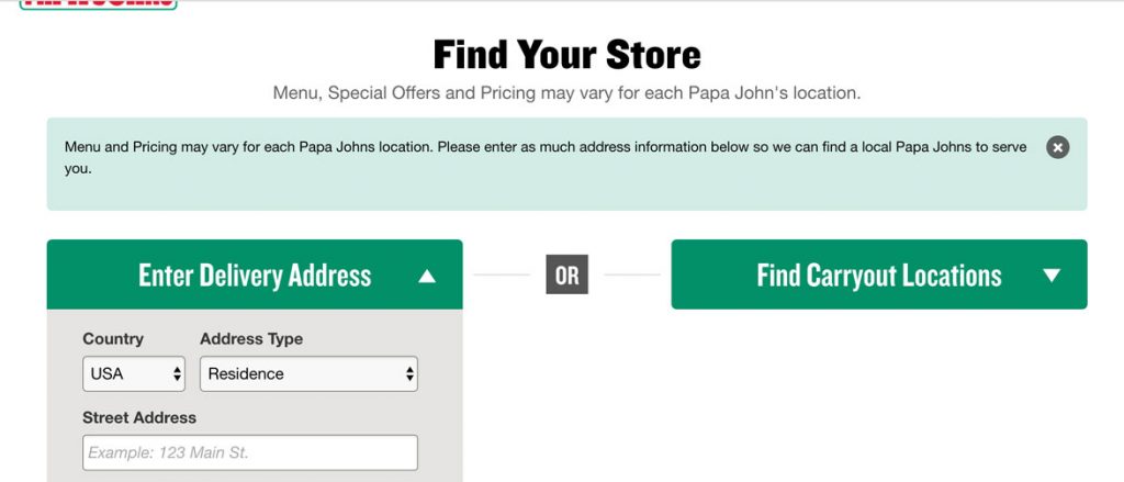 But for this user experience I clicked on Specials, because that’s what I would typically do on any online food ordering site, look for the deals. Papa John’s very clearly let’s me know that “Menu, Special Offers and Pricing may vary for each location.” so I need to let them know where I am. Makes sense to me.
I also like that if I am carrying out I can just give them my zip code and not my whole address, it’s a nice touch for privacy. I enter my address, click Submit and am taken to…
…Menu, not Specials. That’s disappointing.
I even started scrolling down, was confused about the odd look of specials and had to click on the Specials menu item again.
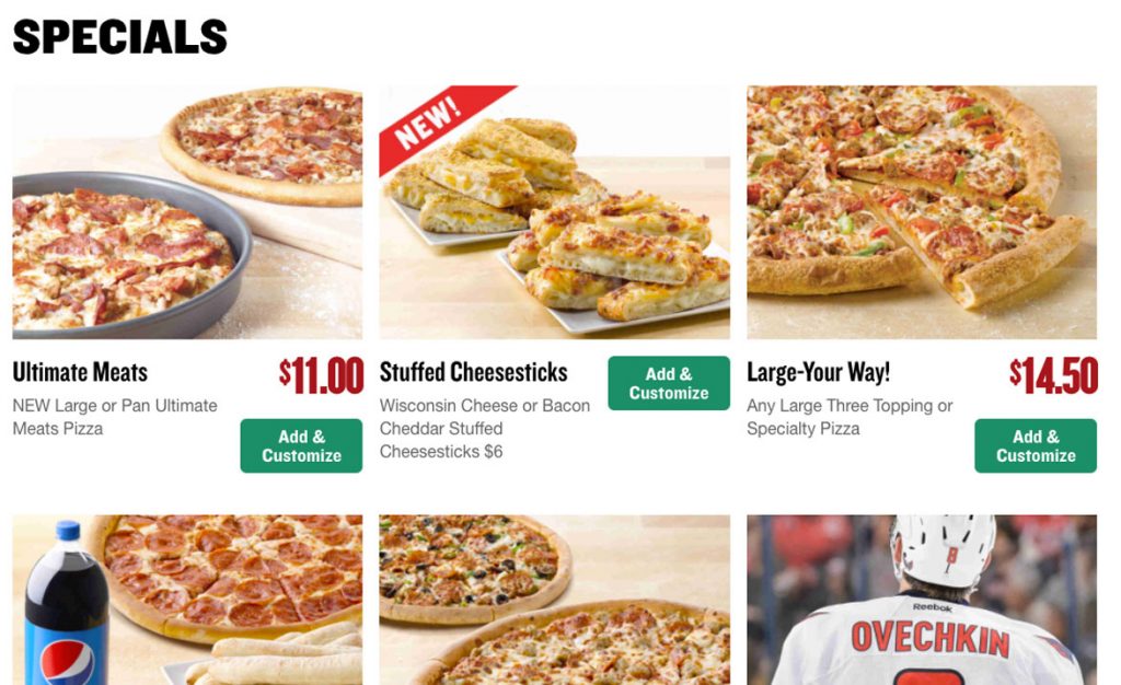 The Specials page is laid out in a 3 column view and looks clean, but with a slight modification could be improved by adding consistency to each item. Standardizing button placement as well as pricing would add uniformity to this page and give a better structure. Right now the buttons are positioned on the right, high and low, while some items have prices and others don’t. Also, letting the user click the beautiful picture as well as the Add & Customize button would be a nice touch.
I clicked on Add & Customize for the Large-Your-Way! Deal. This opened up a new page with the options for specialty pizzas, from which I chose John’s Favorite and entered into the pizza customizer.
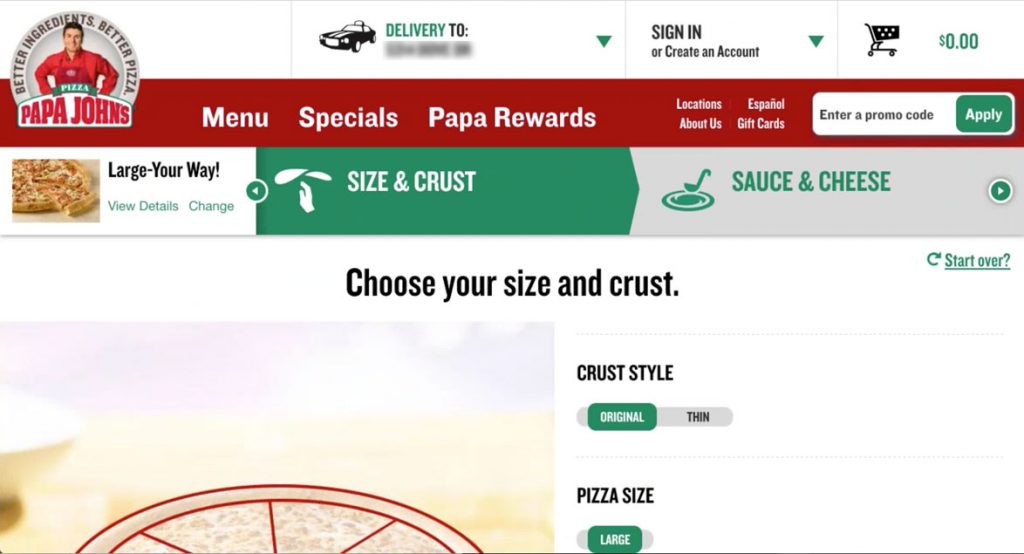
One thing that struck me right away with this page is the amount of screen real estate being eaten up by the top two menu bars which at this stage in the experience are unnecessary. As a user I am focused on creating my pizza and as a site designer I don’t want you navigating away from this experience, so it benefits both parties to hide these menus or at the very least shrink them significantly.
In addition, the step by step process indicator is larger than it needs to be. Beyond size, this progress indicator allows you to interact with the arrows on either side which takes you through each section (Size & Crust, Sauce & Cheese, Toppings). Each section seems as if it’s clickable, but when you click…nothing happens. Having a progress indicator in a wizard is a great way to show users where they are and how many steps are coming, but this one is suffering from a few problems. In order to fix it, put all steps on one screen, reduce the height and either make each step interactive or change remove the hover effect of a pointer indicating an interactive element.
One last note about the screen real estate. The font size for “Choose your size and crust” heading is huge. It doesn’t need to be this big. All together those four elements take up 57% of the screen so I’m forced to scroll down to get to the magic…
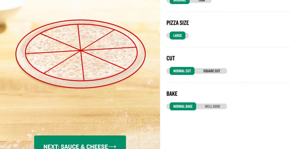 …and so I’m ready to start customizing the pizza. The experience allows me to customize most anything I want and as I do so the picture of the pizza on the left to show off my updates.
It’s pretty cool.
But this too is oversized, so after I make my selections I have to scroll down to find the Next button. The pizza is floating in space on a heavenly looking counter and all that space could be shrunk in order to fit the pizza and the button on the screen at once.
When I do hit the Next: Sauce & Cheese button it shoots me back up to the top of the page and I have to scroll down again, and it does this with each step. Creating a holistic pizza building experience that resizes based on screen size would fix all of these issues.
Aside from sizing, I only had two issues with the building experience, one big and one small.
The small issue is that if you choose no cheese, the pizza doesn’t update by removing the cheese from the picture. However if you change your sauce from Original to BBQ or vice versa the pizza does an animation showing you that the sauce has changed, then slapping the cheese back on, which is a nice touch. For users picking no cheese, not showing cheese would be optimal, but if that’s too much work, then at the very least tell the user that the picture does not represent what will be delivered.
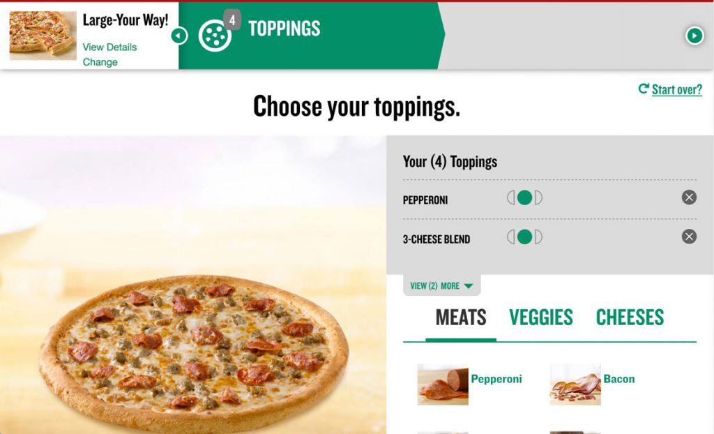
The big issue is with the topping menu. I have four toppings chosen when I arrive (because of the specialty pizza I chose) but it only shows me two and then has a small call out to view 2 more. I know why they do this…to save space, but as this hasn’t been a priority with the rest of the experience why did they choose this as the place to show less information?
I do really like how easily Papa John’s allows you to pick half toppings and the graphic way in which a user can easily tell how the pizza is split up. The pizza even animates removing toppings from half. Also the presentation of the toppings, separated into Meats, Veggies and Cheeses with beautiful pictures is solid.
However, as I add toppings sometimes the pizza is only partially visible. If this is supposed to be the user’s focal point, the pizza should stay centered on the screen at all times no matter how much the right side grows or is scrolled.
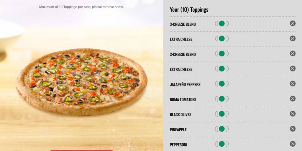
In two instances I did things I wasn’t allowed to do. First, I added too many toppings (it tops out at 10) and then I took away too many toppings (you can only remove 2 toppings from a specialty pizza). In both instances a tiny error message was presented that I had to hunt for, because I couldn’t figure out why I was being stopped. It was tiny text above the pizza and both times it was actually off screen when it occurred so my experience just stopped working. An alert pop-up or a red message bar that sticks to the top of the screen would be much more noticeable and not leave the user feeling confused.
To be fair, Domino’s nor Pizza Hut had anything better when it came to adding toppings to the pizza, but I’ll cover that in their breakdowns. It’s an interesting design challenge that I’ll tackle in a future post.
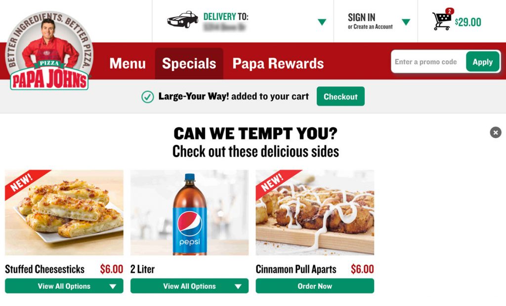 After finalizing my pizza customization I clicked the Add To Order button and was taken to a screen asking if I can be tempted with other offers, which is great. It’s a good time to upsell users.
Right below the main menu a message pops up “Large-Your-Way! added to your cart” with a green checkout button. I scrolled down the page to check out the other offers, but then when I scrolled back up the checkout button was gone. I went through the experience again to see what happened and after about 10 seconds this bar disappears leaving me in temptation limbo.
This shouldn’t happen. I’m not going to buy more now because I got stuck on this page. In fact, there should be an additional checkout button added below the temptation items as well to give me a clear path to get to the checkout when I’m ready to hand over my money.
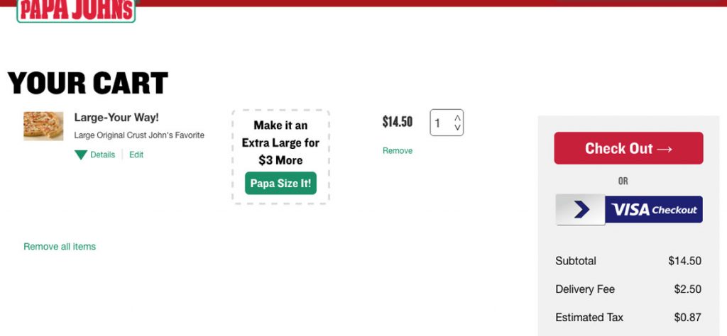 I ended up clicking on the Cart icon in the upper right corner. The cart could use some help with spacing as well, but I think I’ve covered that enough. The Papa Size option is a nice touch. Overall this has everything I need and I quickly hit Checkout
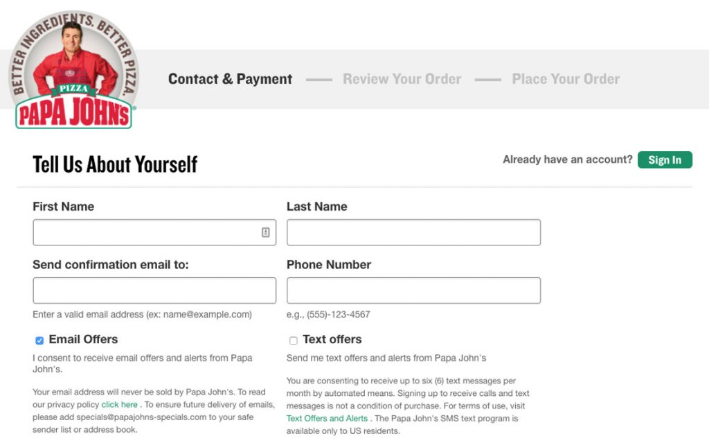 For me, I already have an account and would like to sign in but my reaction was to begin filling in this information and then after a few keystrokes realize my mistake and look for the sign-in prompt. This could be avoided by moving the green sign-in button right under Tell Us About Yourself. I couldn’t miss it then.
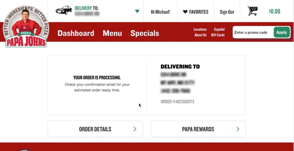 And the last few screens step you through the finalization process very smoothly and easily.
Boom! My pizza’s on the way. It would be nice to have some sort of update on the site itself instead of having to check my email, but I have no complaints about this experience. It works.
Overall, ordering from Papa John’s is easy and I only felt lost once, when I couldn’t find the checkout button that disappeared on me. There’s more scrolling than there needs to be in some places and the main navigation of the site could go on a diet (maybe it’s eaten too much pizza), but it never hindered me from getting to my end goal. Rather it just made me think and click a little more than I should have to, which is exactly what you want your users to avoid doing – thinking too much.
This feedback is just from one user run through, which I hope helps to show the value of user testing and iterative design in order to get the most streamlined experience you can, because at the end of the day a better experience means happier customers and happier customers means more pizzas sold.