“Allez cuisine!”
This is the big finish! The last of a five part series breaking down the user experience for three of the national chain pizza delivery stores. The first post breaks down the what and the why behind the series and the following three analyze the online ordering user experience for Papa John’s, Pizza Hut and Domino’s.
This analysis is based on online ordering using my 13” MacBook on a Chrome browser. I’m a user that has an account, but haven’t ordered for a while and not signed in. I want pizza for my friends and I on a Friday night.
The four categories I evaluated were:
- Onboarding/First Interaction
- Pizza Builder
- Post Creation and Checkout
- Post Checkout
All three of these companies are managing multiple products and many points of user experience and this is only a breakdown of one aspect. Beyond this there could (and should) be tests run on the mobile app, mobile web ordering, overall menu organization, ordering for an avid user, ordering for a normal return user, big orders and so on. Being very specific in your test is important in order to limit the variables and come away with actionable results.
Hypotheses
The original hypotheses I made were:
- Users will be able to easily add a pizza to their cart and checkout quickly
- All the experiences will be fairly similar
- Only minor UX issues will present themselves
The first two are true. With all three experiences users can get in, create a pizza add it to their cart and checkout quickly. I should have defined quickly as a hard and fast number to be able to analyze this better, but my Mom could do it in less than 10 minutes and that’s the bar I’ll use.
All the experiences were fairly similar as far as structure. Homepage > capture information > pizza builder > upsell > checkout > post.
There was a major UX issue which I’ll cover below, so my third prediction was a little off.
Onboarding/First Interaction
Winner: Papa John’s
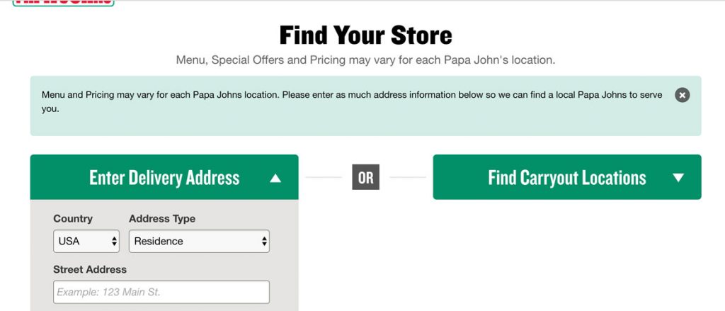
While all three had beautiful home pages, once you stepped into the experience it was Papa John’s that had the most user friendly introduction by stepping the user through connecting to the store nearest them before diving in.
There was a small hiccup after I let them know where I was which took me to Menu instead of Specials, but of the three this was the most minor infraction. Domino’s was the only one of the three to get this right and take me where I was trying to go prior to information gathering.
Domino’s and Pizza Hut both created a barrier for the user to climb before getting to ordering their food. Papa John’s asked for the information that was needed at the right time, communicated clearly as to why they needed it and created a connection between the user and the store with the phrase “Find Your Store.”
The major UX issue was with Pizza Hut onboarding and the fact that it took five clicks to get back to ordering my food and then I was thrown in the middle of a page with no reference as to what I was doing. You can read about it in my full Pizza Hut breakdown.
Pizza Builder
Winner: Pizza Hut
Building a pizza is hard work and then you combine that with a meal deal or special involving multiple options it becomes a hard core UX challenge.
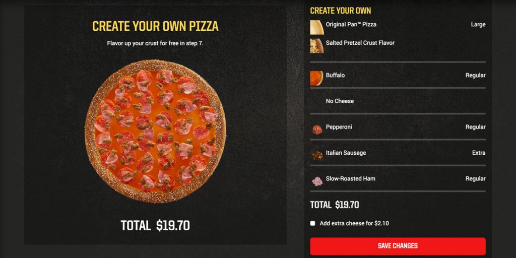
Pizza Hut had a few issues but overall their pizza building experience beat out the rest. There were several aspects that stood out above the competition.
Keeping the pizza centered on the screen – as the user scrolls through the process building their pizza, the picture is always there for reference, front and center.
Organization – numbering all steps in the process vertically, pushing the user through their choices in a very clear and concise way.
The picture speaks – updating every aspect of the pizza on the picture. Crust, no cheese, type of sauce, regular toppings, extra toppings, half and half, they never missed a beat, it was all shown on the picture.
An overview – Scrolling through all the steps, the last thing you see is a clear, well-designed overview of the order, prior to moving on.
Post Creation and Checkout
Winner: Pizza Hut
 This was category was close.
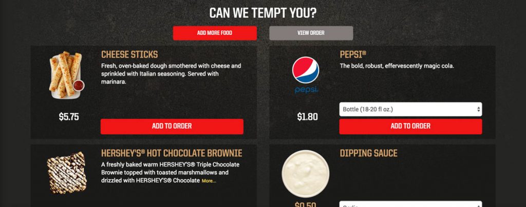
It was a toss-up between Papa John’s and Pizza Hut. Both sites had an easy checkout, but Pizza Hut was the winner because of Papa John’s disappearing checkout button. Papa John’s had a checkout button that would disappear after being on the “Can We Tempt You?” screen for 10 seconds, potentially leaving the user confused, as I was. Read about it in my full Papa John’s breakdown.
Pizza Hut also placed buttons at both the top and bottom of the screen to get to the order and also to ultimately checkout. The buttons to achieve this were gray, which I recommend updating to a less disabled color, but it’s better than no button at all.
Domino’s checkout was acceptable but the review screen where it creates steps for users to follow which aren’t really steps at all took them out of the running. Read about it in my full Domino’s breakdown.
Post Checkout
Winner: Domino’s
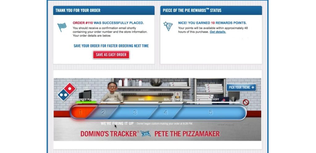 This one was easy. Domino’s is the only one with a post-checkout experience and it does wonders for them. Users think Domino’s is awesome because they are left with a final awesome experience. But it’s not just because it was the only experience, the Pizza Tracker is really cool, and it keeps the user engaged in the 30-40 minutes between order and delivery.
Domino’s is focused on improving the technology and doing amazing (crazy) things like delivering by robot and had its first pizza delivered by drone.
These things matter and users are left with a feeling that Domino’s is cool and that’s a lasting impression that’s helping to sell more pizza.
To read more about how Domino’s reinvented itself in the tech space, check out this article.
Overall
All three experiences accomplished the goal. Get pizza delivered to my house for my friends on a Friday night. There wasn’t one experience where I felt like throwing my computer through a window, but there was one experience that I felt took more consideration for a first time user and the flow that is required to get that user across the finish line.
In the end, it came down to a hiccup in Pizza Hut’s initial experience that kept them from taking the crown.
Winner:
![]()
If you’re like me, you’ll probably want some pizza now. Go for it:
I hope you enjoyed this series, it was a lot of fun to put together, comparing and contrasting some of the top chains in the country. Plus, I had an awesome night ordering some pizzas with friends. I am considering doing another look at the experiences focused on mobile ordering. If that’s something you’d want to see, leave me a comment below or share on social media.